We may earn revenue from the products available on this page and participate in affiliate programs.
Welcome to Space Shifter, writer and A Tiny Apt. creator Christene Barberich’s monthly diary documenting the gradual (i.e., slow, thrifty, and experimental) transformation and reimagining of her family’s newly acquired mid-century building in upstate New York. We are so happy you’re here.
Chapter 3: From Eerie Exam Room to Country-Chic Bedroom
One of the biggest challenges we faced when we bought our future upstate New York weekend home was figuring out how to make it uncreepy. That might seem simple, but believe me, sleeping in a former ’60s doctor’s office overnight can be a touch unsettling. Even though the building itself is pretty classic in structure and light on the spookiness, it still reads clinical as opposed to cozy. And as I’ve written earlier in this column, it’s going to be a while before we do any kind of serious renovations while we accrue the funds to realistically overhaul it the right way.
In the meantime, the most pressing question was this: How do you go about making a pretty classic medical exam room—four of them, to be exact—feel peaceful and pleasing to the eye, as well as a soothing place to hunker down at night? Logistically, only two of them are being used as bedrooms—one for guests and one for my husband and me—while our daughter occupies one of the wood-paneled doctor’s offices, which posed less of a challenge in the warmth department. Dealing with flat gray linoleum floors; gross, thick industrial blinds; and dropped foam ceilings is enough to have any solace seeker running for the hills! But as with any big challenge, you begin with what you can change, focusing less on what you can’t (yet).

As I shared last month, my husband did the whole house proud by pulling up all the hideous corporate carpeting and painting the plywood floors a crisp white—a speedy, cost-effective transformation that paid dividends in making the building instantly fresh and homier. We applied a similar approach to the exam rooms, painting over the linoleum with a few coats of the same white paint. Since it would be temporary, we were okay with some scratches here and there, given the material wasn’t absorbent like wood. We took down all the blinds, and in our bedroom we had someone come and take out the extra sink that ate up precious space and made it feel too much like sleeping in a youth hostel (albeit a cool one).
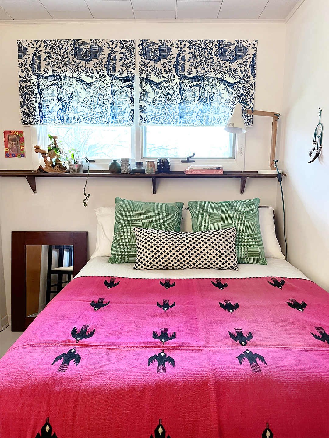
As a big believer in the lasting impact and flexibility of great textiles (next to paint, they are the quickest and most inexpensive route to shifting a look and mood fast), I did some experimenting. I have a pretty extensive collection of vintage remnants, and I found two identical scraps of old Schumacher fabric that seemed perfect as window treatments in our bedroom. We had some extra double-sided adhesive from a package of plastic utility hooks that turned out to be sturdy enough to mount each swatch perfectly, no hardware or hemming needed.

I dove back into my mini textile collection and tried out any spare rug that fit the space, from basic earthy sisal to a more intricate Moroccan pattern. I am a firm believer in mirrors, good printed textiles, and small statement rugs—grab them when you find them, even if you’re not sure where you might put them. They don’t take up much space if you need to store them, and they are utterly magical when it comes to energizing a dull corner or forgotten room. While I think we’ll continue to switch the rugs up, depending on my mood, we landed on a 3-by-5-foot high-pile design from Archive New York (one of the greats when it comes to statement pillows and other home goods). The dense weave feels luxurious in such a small space, and it’s nice to have that cozy touch be the first thing my feet hit in the morning.
As such, I’ve been holding on to a hot pink vintage Mexican blanket by Fred Leighton for nearly 15 years, just waiting for the right room to place it. I found it on eBay eons ago and—knowing how rare his late-’50s/early-’60s housewares were from his first store on MacDougal Street in Greenwich Village (before he was even designing jewelry!)—definitely did a dance when I won it for about $200. In this tiny former exam room, the blanket is an instant infusion of brightness but also makes the whole space feel cocoonlike.

I know decorating or redoing just a corner of a room can bring up lots of worries or insecurities about making decisions, so I’ve always relied on a mix of patterns and textiles to get me through problem-solving. Playing around with printed pillowcases, rugs, wall treatments, or blankets has been the thing that sparks my heart and tells me what to do next. It’s like my own love language, and I encourage you to experiment, too—layering different pillows or paint colors or splurging on a bright-patterned rug. For me, they function like building blocks in making a room feel connected and alive.
Speaking of being connected—we decided to keep the long slender shelf under the window from the bedroom’s former exam-room life. It’s perfect for hosting a menagerie of thrifted pottery, bedtime reading, and small plants, especially when there is limited open floor space. And even though it might be a few years before this bedroom (and the others) look airier and a whole lot more cohesive post-renovation, creating a pretty and comfy place to rest and recharge on weekends will definitely make the wait a bit more livable.
