We may earn revenue from the products available on this page and participate in affiliate programs.
At first, architect Charlotte Fequet and colleague Maud Tyzon’s job was simple: Replace the sad, cold ceramic flooring in their client’s 1,400-square-foot apartment with warmer wood planks. “The couple, Aude and Antoine, and their two teenage daughters had been living there for almost 10 years and wanted to make their home more in tune with their personality,” Fequet remembers. It’s never too late for a change, after all.
But afterward, Fequet still felt the home, located in the heart of Paris’s 18th Arrondissement, wasn’t quite welcoming. What was initially supposed to be a quick and easy transformation turned into a complete reorganization of the apartment’s layout. In the living area, moving a wall near the fireplace made more room for family and friends to gather when they come over. In the couple’s bedroom, the architects divided the original space in two, allowing them to carve out a closet between the bedroom and the bathroom to optimize storage.


“The family was obsessed with soft lines,” says Fequet (luckily swooping curves and contoured millwork are her signature). Every rectangular door in the apartment was replaced with sliding glass openings with arched detailing to create the optical illusion of an airy, open space (in the kitchen they serve a more functional purpose by helping keep cooking odors out of the living room). At the foot of the staircase, a bending wood banister does triple duty as a desk, room divider, and piece of art. “Its shape alludes to a sunset,” says Fequet.

According to the designer, curves are the best way to visually change the proportions of a room while adding a graphic element. “Round shapes diffuse the light in a softer way, especially in a bedroom,” she adds.


Yves Klein Blue takes on many forms in the home, from the living room and headboard alcove wallpaper (a nod to Paris’s vegetal decks and avenues) to the primary bathroom’s herringbone-patterned shower tiles. “It is the couple’s color crush, as it reminds them of their favorite holiday destination: Greece,” notes Fequet.


The couple’s bedroom in particular was meant to feel like a hotel suite (they both liked the idea of a cozy room in which they could relax, work, and conveniently store all their belongings out of sight). There is lots of hidden storage for winter clothes and shoes, plus a built-in desk in one of the corners.


As a way to bring the outdoors in (the apartment has two sunny terraces—a rarity in Paris), Fequet custom-designed a dual-tone mirror to go over the living room fireplace. The cloudlike shapes in the glass reflect the incredible views and help bounce natural light around the room.


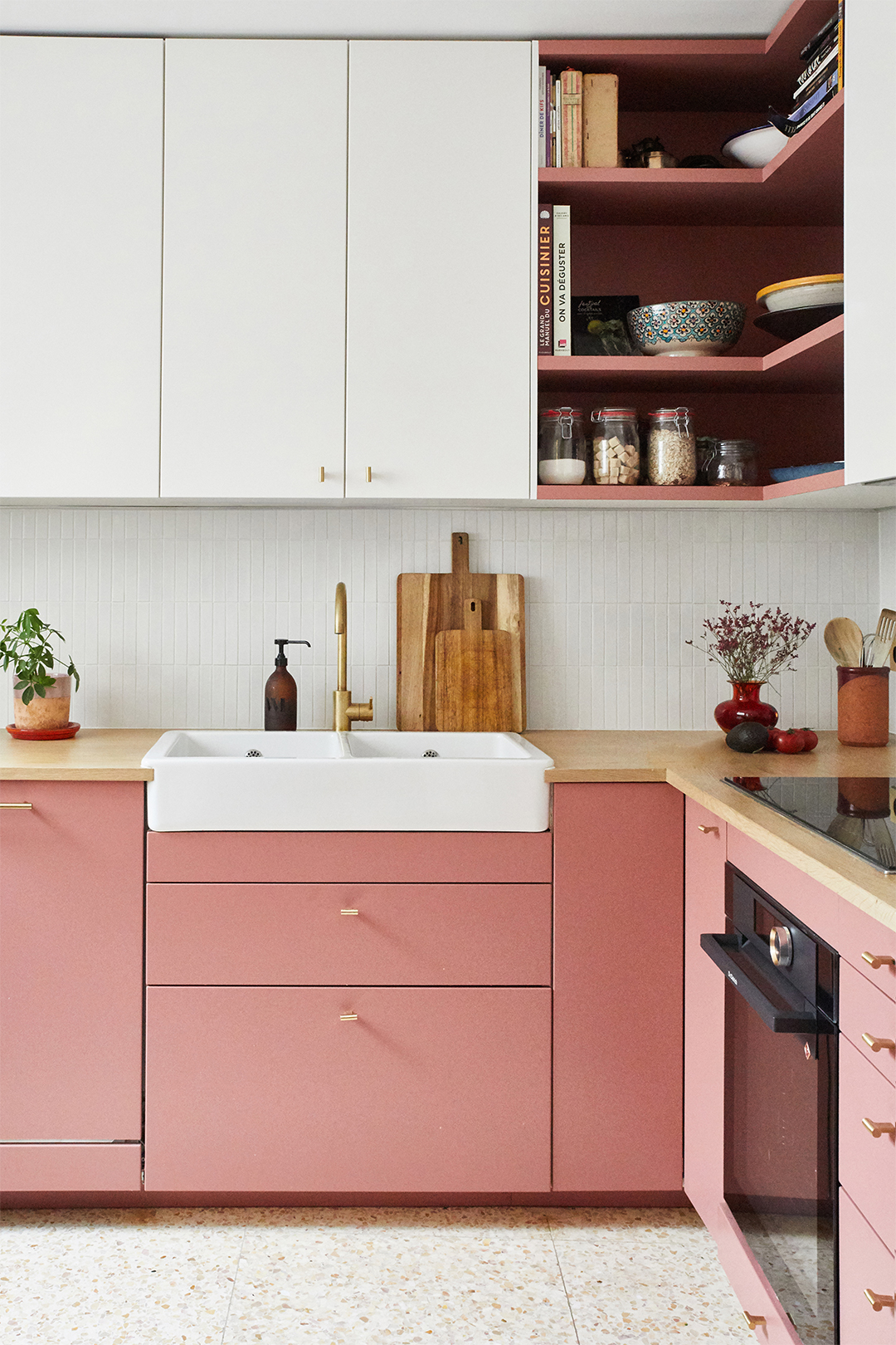
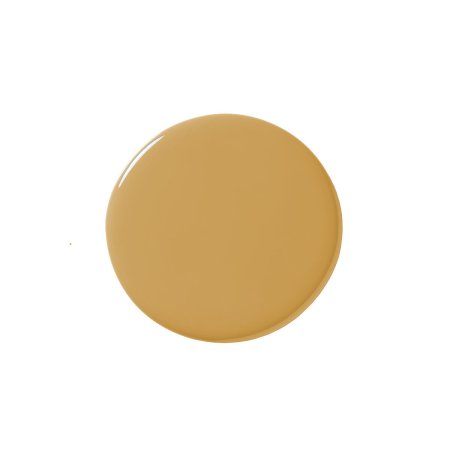
The ochre bookshelves on either side are one of two moments that depart from the home’s cobalt-heavy color scheme. But it’s the kitchen, with its rosy cabinets and terrazzo floor tiles, that’s the biggest surprise. “Antoine was really attached to the idea of a pink kitchen to warm up the space and contrast with the rest of the apartment,” says Fequet. “We were all surprised by the choice, but in the end he was right!” And to think, a basic flooring swap started it all.

The Goods


