We may earn revenue from the products available on this page and participate in affiliate programs.
Most people bring Pinterest boards and paint swatches to their first meeting with an interior designer, but this artist client, who had just purchased a 1,200-square-foot apartment in Bozeman, Montana, for her family, handed Abby Hetherington a handful of dried wheat. She was more into abstract colors and textures—in this case the subtle neutral tones—than she was inspiration photos.
The building was a brand-new construction, so renovating the kitchen wasn’t even on Hetherington’s radar initially. Then she started filling the open-plan layout with beige, cream, and camel pieces inspired by a central work by the artist in the living room—and the industrial-style black Poliform cabinets and stark white Ceasarstone countertops stood out like a sore thumb. While keeping the floor plan intact (save for a few upper cabinets that got the boot), Hetherington worked on blending the space in with its surroundings.
Find a Backsplash in a Haystack

Boxes of honey-hued tile samples from BDDW were sitting in Hetherington’s office, so when she saw the dried wheat, she immediately knew they would be the perfect fit for the project. “I bought every box the founder had left and had them shipped back,” says the designer. It became the neutral-but-not-too-neutral backdrop for the range wall—and served as inspiration for the whole space.
Tuck Everything Out of Sight

Working with the existing footprint, Hetherington squeezed a floor-to-ceiling pantry onto one wall and recessed the previously exposed refrigerator on the other end of the countertop using rift-sawed oak doors. “You have the weight of the fridge on one side and the storage on the other, which created two equally balanced volumes,” explains the designer. No uppers, no problem—because the owner had previously lived in England for 10 years, she was more than comfortable with having tall cabinets that doubled as a coffee and breakfast station.

The dimensions of the room also dictated the narrower-than-normal island, which in turn meant Hetherington couldn’t add counter seating along the whole length as the owner wanted: “She loves to be able to have her kids hanging out with her when she’s cooking,” notes the designer. A compromise was in order—a nook for a single stool, giving the centerpiece both storage and seating.
Look Across the Pond for Ideas


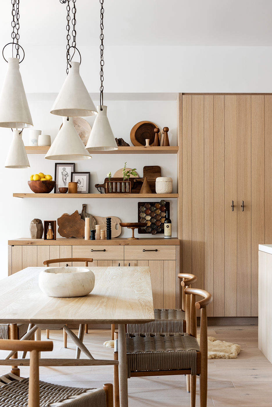
Another nod to the Brits came by way of a long open shelf flanking the range hood, with a row of pegs underneath to hold everything from serving boards to tea towels. To make the most of a wasted corner, Hetherington continued the shelving to form an L-shape and added two more levels to store large serving bowls. On the opposite side of the full-height pantry, the shelving continues over the dry bar (with concealed wine fridge!), which anchors the dining area.
Choose Concrete, But Not the Industrial Kind

Hetherington wasn’t interested in a shiny stone for the countertops, so she turned to concrete instead. “The vendor we got it from actually casts them in a linen fabric to give it a raw texture,” explains the designer, who also matched the shade to one of the lighter tiles to give it that warm, fabric-like tone. The range hood was then plastered to match. If you look closely, every hue in the room refers back to the backsplash: Peep the beaded oak doors with planks of varying widths (another trick Hetherington used to give the room an organic feel) and the rice paper–hued plaster. It’s as close to a handful of wheat a kitchen will ever get.
Our Winter Renovation issue is here! Subscribe now to step inside Leanne Ford’s latest project—her own historic Pennsylvania home. Plus discover our new rules of reno.
