We may earn revenue from the products available on this page and participate in affiliate programs.
Interior designer Samantha Gallacher of IG Workshop received very clear directions from her clients, formerly of Miami, regarding the design of their new Boca Raton, Florida, home: “We don’t care what you do—just make it not Boca,” she recalls. So that meant the ornate wrought-iron staircases and cove ceilings had to go, but there was one original ’80s-era detail throughout the house that she couldn’t do away with: multiple arches.

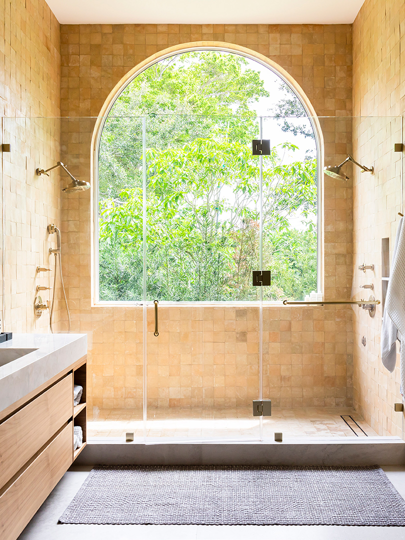
From the giant round bathroom window to the multiple moon-shaped doorways to the ribbon-y staircase (topped with a Giopato Coombes chandelier), curves appeared so often throughout the three-bedroom home that Gallacher and her partner, Renata Vasconez, chose to embrace most of them but did end up removing a few above built-in bookshelves because, well, you can have too much of a good thing.
But then she also added some back in, like the ribbed walls in the open dining-slash-living room, a result of Casa Metier fluting on the walls, which comes in foam panels that she lined up and painted over. And then there’s that epic fireplace, made from a slab of pink onyx she found in Miami and cut to fit the house’s half-circle theme.

To further modernize the space and make it feel a bit more like the family’s hometown, she gave it a fresh wash of Sherwin-Williams’s Snowbound paint and filled the living room with matching ivory furniture (made with performance fabric, because her clients have kids and a dog). “Originally that rug was white, too, and they were like, ‘We love you, but you are crazy,’” says Gallacher, laughing. So she added the Rock Paper Edge rug from her own line, Art + Loom, which adds color and grounds the room.


In the dining room, Gallacher went with a terrazzo Carrara marble Miniforms table she scouted at Salone del Mobile, then surrounded it with CB2 dining chairs—the point being that children (and if we’re being honest, adults, too) might spill things and stain the seating, so it’s smart to buy them from a retailer where you can easily replace them. And along that same line of thinking, the designer nixed the idea of a rug under the dining table, instead flipping the direction of the flooring and adding a brass outline that would act as a “rug” to define the area.


In the kitchen and TV room, 90-degree angles start to take over again, and a taupe-y mocha lacquer (on cabinets and a media console that hides the kids’ toys) replaces the rest of the home’s bright white palette. Black Buster & Punch hardware grounds the kitchen, giving it an industrial edge, especially over the sink, where shelving lets the light come through but also acts as storage.

If the bottom floor is bright and airy, then the upstairs brings the drama. In the main bedroom, a custom headboard mingles with Drop It Modern marbleized wallpaper, and a black pendant light from Brokis (another Salone find) creates a cool contrast. In the home office, Sherwin-Williams’s Caviar covers the walls, and there’s a dark Art + Loom windowpane rug.


Miami or Boca, residing in Florida requires a certain amount of time spent outside, and when the family entertains alfresco, it usually involves their grill, which is hidden in a nook covered in terracotta Popham tile. Otherwise they’re reclining in their outdoor living room, soaking up the Boca sun.


