We may earn revenue from the products available on this page and participate in affiliate programs.

Bold enough to fulfill your cravings for color, but easy enough to live in your house forever, blue kitchens are staking their claim. But are you really surprised? Blue paint colors have been trending in a big way for the past few years. And while we’ve seen the hue take shape in saturated bedrooms and pattern-forward bathrooms, the color lends itself particularly well to the heart of the home.
From matte sapphire to midnight, we’ve seen just about every shade work wonders for kitchens. So how do you know which swatch is right for you? We asked the owners and designers behind 18 of our favorite blue kitchen cabinets to find out. Read on for the exact paint colors to try for the same looks.
The Farmhouse Blue: Marea Baja by Sherwin-Williams
Designer Charlie Ferrer pulled from this Hamptons home’s original blue and white color palette during the renovation, resulting in harlequin checks on the hardwood floors and this “cool denim blue” on the cabinetry. “A room doesn’t have to be cottagey to feel whimsical,” he says—and we think this sophisticated mix of color and pattern embodies that motto.
The Blue for Tall Cabinets: Bluebird by Paint & Paper Library

If you want to sneak other paint colors into your kitchen, consider relegating blue to a wall of tall pantry cabinets. This breezy blue lends a sense of airiness to this kitchen, designed by Lizzie Green.
The Blue Trifecta: Pale Powder, Light Blue, and De Nimes by Farrow & Ball

Washington, D.C.–based designer Zoe Feldman gave the kitchen’s existing cabinets a gradient facelift by using a variety of blue paints (the walls are Pale Powder, the medium door fronts are Light Blue, and the pantry cupboards are De Nimes, all by Farrow & Ball). “When you squint your eyes, they kind of smudge together,” says Feldman. “It’s very calming.”
The Boutique Hotel Blue: Beach Glass by Benjamin Moore

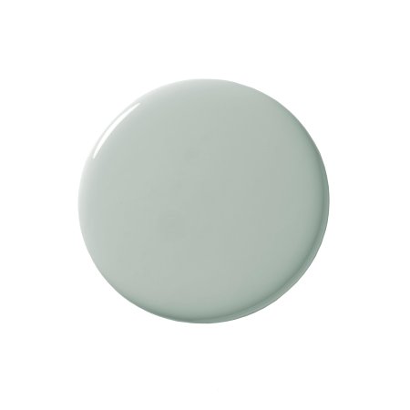
The kitchen at Daunt’s Albatross Motel will make you want to book a ticket to Montauk ASAP. Designer Oliver Haslegrave, founder of Brooklyn-based Home Studios, chose a soothing blue with hints of gray and seafoam that play nicely with the flagstone floors and cobalt backsplash.
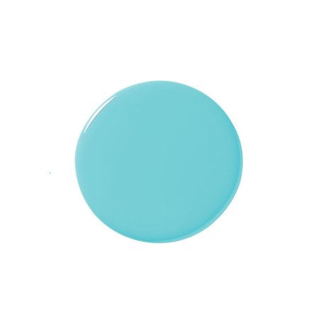
The Tropical Blue: Soft Turquoise by Behr

In artist Abel Macias’s Los Angeles home, the kitchen is painted a vibrant turquoise to match the original 1920s linoleum floor. “We couldn’t change the tile, so we decided to fully embrace it,” he told us.
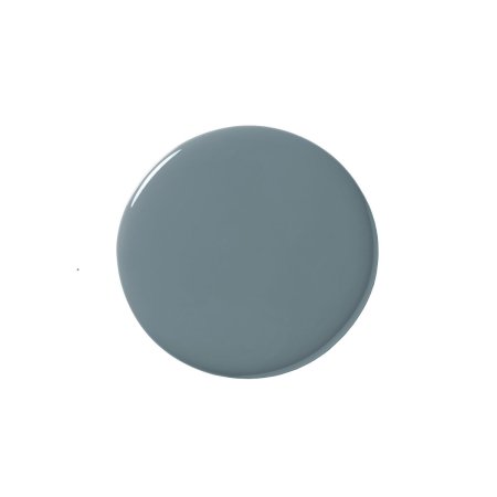
The Gray Blue: Bleu Byzance by Argile Pinture

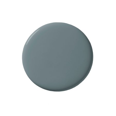
In Julia Rouzaud’s kitchen, a complete gut reno, a rich gray-blue coats the cabinetry. Paired with a burnt terracotta hood and rosewood hardware, the shade appears more like cornflower in person.
Bleu Byzance, Argile Pintures
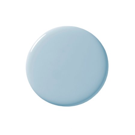
Shop NowThe Sky Blue: Solitude by Benjamin Moore

Designer Elizabeth Stamos saved close to $30,000 on her kitchen remodel by keeping her existing Shaker-style cherrywood cabinets and simply painting the fronts in this sophisticated shade. She added trim to the top of the cupboards for a bespoke look.
The Grounding Blue: Blue Note by Benjamin Moore

The saturated navy blue island in this Studio McGee–designed space acts as a centering force in the almost-completely-white room. The subway tile and crisp white uppers have so much more character thanks to the statement moment.
The English Blue: Hicks Blue by Little Greene

Classic and modern all at once, the dreamy matte shade that Tiffany Grant-Riley chose for her Edwardian house in Kent, England, was a fitting choice for the historic space (the home is more than a century old). After dousing the cupboards in the color, she painted the wall next to them so it reads like one unit.
The Retro Blue: Lambeth Walk by Mylands

Calling all white kitchen devotees: Consider this seamless London kitchen by Jordan Cluroe and Russell Whitehead of 2LG Studio the ultimate case for embracing subtle color. Given the pale blue hue’s vintage vibes, the pair took a contemporary approach to the cabinetry by opting for cutouts over hardware. “We had cherrywood put in the backs of the finger-pull handles on the drawers to reference the original cherrywood doors throughout the apartment,” says Whitehead. “The warmth of the cherrywood works beautifully with the cool blue.”
The Barely There Blue: Kentucky Haze by Benjamin Moore

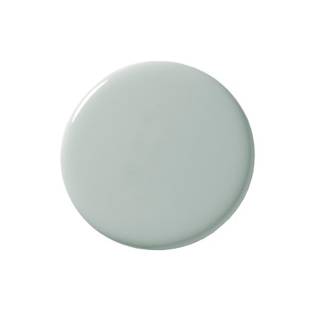
Inspired by the pale gray hues of the U.S. coastline and the earth tones of the Southwestern desert, this soft, neutral blue effortlessly marries the colors of the American landscape. It seems only fitting that the shade found a place in Kim West’s Austin home. In true camouflage form, the inset appliances blend right into the picturesque background.
The Oceanic Blue: Oval Room Blue by Farrow & Ball

In this coastal Maine home, designed by Heidi Lachapelle Interiors, a maritime blue rounds out the waterfront views beyond. While the subtly aged and not-too-nautical choice was largely inspired by a large oil painting that sits in the same space, this color stands on its own.
The Fan-Favorite Blue: Hague Blue by Farrow & Ball

It’s easy to see why Hague Blue has become one of the most popular swatches for the kitchen and beyond: This color is incredibly versatile. In a serene San Francisco home by Saffron and Poe, the striking shade takes on a Mediterranean point of view against a graphic tiled backsplash.
The Professional Blue: Gentleman’s Gray by Benjamin Moore

Formal, tailored, and totally classic, Gentleman’s Gray is the blue swatch equivalent of a wise British man in a top hat. That said, the hue’s sophistication lends itself particularly well to edgy and contemporary designs. Just take this unexpected kitchen by Black Lacquer Design. Juxtaposed with a rich slab of black marble, the matte color feels decidedly fresh.
The Feels-Like-Vacation Blue: In the Tropics by Benjamin Moore

Reminiscent of turquoise waters in the Caribbean, one can almost feel the warm ocean breeze in Edith Young’s New York City kitchen. Given its sultry tones, Young used the swatch cleverly, honing in on a smaller space so that its luxurious color could have major visual impact.
The Background Blue: Heron Blue by Portola

Tending toward traditional, this balanced hue can go coastal cool or inland sophisticate, depending on the materials, fixtures, and other design details you incorporate into the space. In the case of this beachside retreat in Marina Del Rey, Stefani Stein invoked the laid-back aesthetic of a California rancher by matching the color with a quartzite countertop, farmhouse sink, and oak floors.
The Relaxed Bohemian Blue: Boro by PaperMint

Australian designer Sibella Court’s free spirit shines in her Sydney kitchen, where a “subtle but stormy palette” reigns supreme. The moody, sea-inspired indigo she chose for the island and cabinets picks up on the relaxed yet eclectic vibe and serves as an anchor for the humble materials used throughout her home, like zinc, brass, rope, leather, and cane.
The Green-Blue: Olympus Green by Benjamin Moore

When Homepolish designer Barbie Palomino and her husband, Jason, were renovating their 100-year-old Los Angeles home, she wanted green and he wanted blue. Cue the perfect compromise. A Carrara quartz countertop sets the scene for a fresh and clean space, while the bluish green cabinet color gives the room the playful feel it was looking for.


