We may earn revenue from the products available on this page and participate in affiliate programs.
Fresh and contemporary yet layered and cozy. Such were the primary touch points interior designer Caitlin Murray of Black Lacquer Design hoped to integrate into her latest project, found within a luxury high-rise in L.A. Murray’s approach to the redesign led to a total overhaul, a necessary course of action considering the fact that the condo’s last reno was in the early 2000s. A complete demolition of the kitchen and master bedroom was followed by an array of reworked finishes that encompassed everything from fresh wall paint to new flooring. The result is a fully updated space with a revamped interior that emulated her client’s intended aesthetic for the home: “modern with a hug.”
In the living room, a wall of floor-to-ceiling windows offers panoramic views of the city—a feature that inspired Murray to opt for a palette loaded with neutrals. Herringbone floors were installed to set the tonal groundwork for the room, and from there, luxe layers of textures, metallic accents, and high-contrast hues were added in for a dynamic touch.

“I focused on incorporating tonal neutral hues with large, strategic anchors of desaturated colors, like the pale peach feature wall,” says Murray. “It’s all about balance, function, and flow.”
Murray’s fearless use of color is a prominent motif, liberally integrated throughout the home. The pale peach wall helps establish a separate zone within the open-layout of the home, all the while playing to the richness of the blues of the adjacent kitchen. “I always strive for my spaces to have an element of the unexpected with well-balanced contrast,” notes Murray of the sophisticated combination of the peach and blues. “I think these are principles that cultivate interest, depth, and soul in an interior.”


A total revamp of the kitchen was of the essence. The former space was on the brink of falling apart, despite the fact that it originally featured expensive Italian cabinetry. With the intention of transforming the kitchen into a point of interest for the living room (and vice versa), Murray took on a daring approach when it came to color. “Considering that you can’t really have one without the other in an open floor plan like this, all design choices were made to promote cohesive visual interest,” she notes.
The new space is now outfitted with deep blue cabinets, streamlined in form, paired with an equally sleek and statement-worthy slab of black marble, which extends from the backsplash all the way to the waterfall island.

Directly aside the kitchen, a black lacquered barn door cleverly conceals a coat closet, all the while doubling as an unexpected accent wall that fits right in with the daring profile of the home. “That area needed a bit of extra buzz to balance out the glam going on in the adjacent kitchen,” recalls Murray, “I occasionally find it amusing to overdesign an element that would typically be more mundane.” Said design philosophy was an ever-present feature of the home, extending from the sporadic use of vibrant color and materials to the thoughtful layers of bright metal finishes.

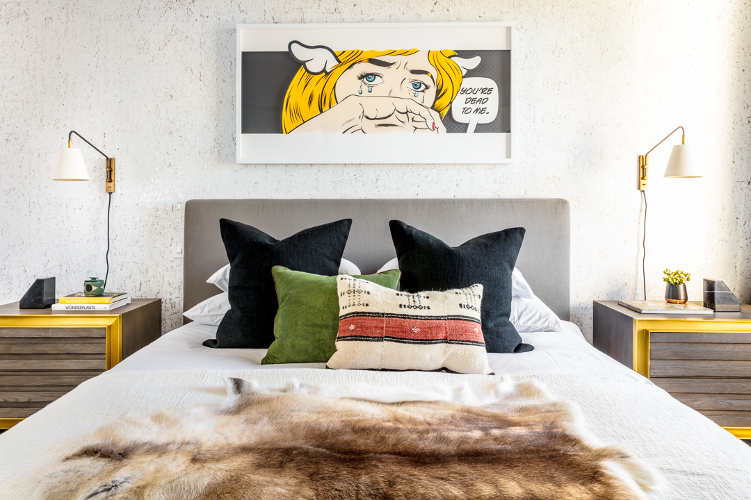
Similar to the rest of the home, the bedroom embodies a complementary combination of rich textures and details. Tonal elements are sprinkled throughout the decor of the room—the yellow-detailed nightstands being a prime example. Murray sourced toned-down variations of the hues found within the wall art and earmarked them for a handful of the secondary decorative accessories found on the bed.
“The white-and-gold cork wallpaper by Monarque created a pretty balance by adding a bit more interest than painted drywall and still letting the artwork shine,” she adds. “I wanted to create more subdued surroundings to let it be [a] statement.” No doubt, that’s a design philosophy Murray seamlessly incorporated into the decorative credo of the home.


