We may earn revenue from the products available on this page and participate in affiliate programs.
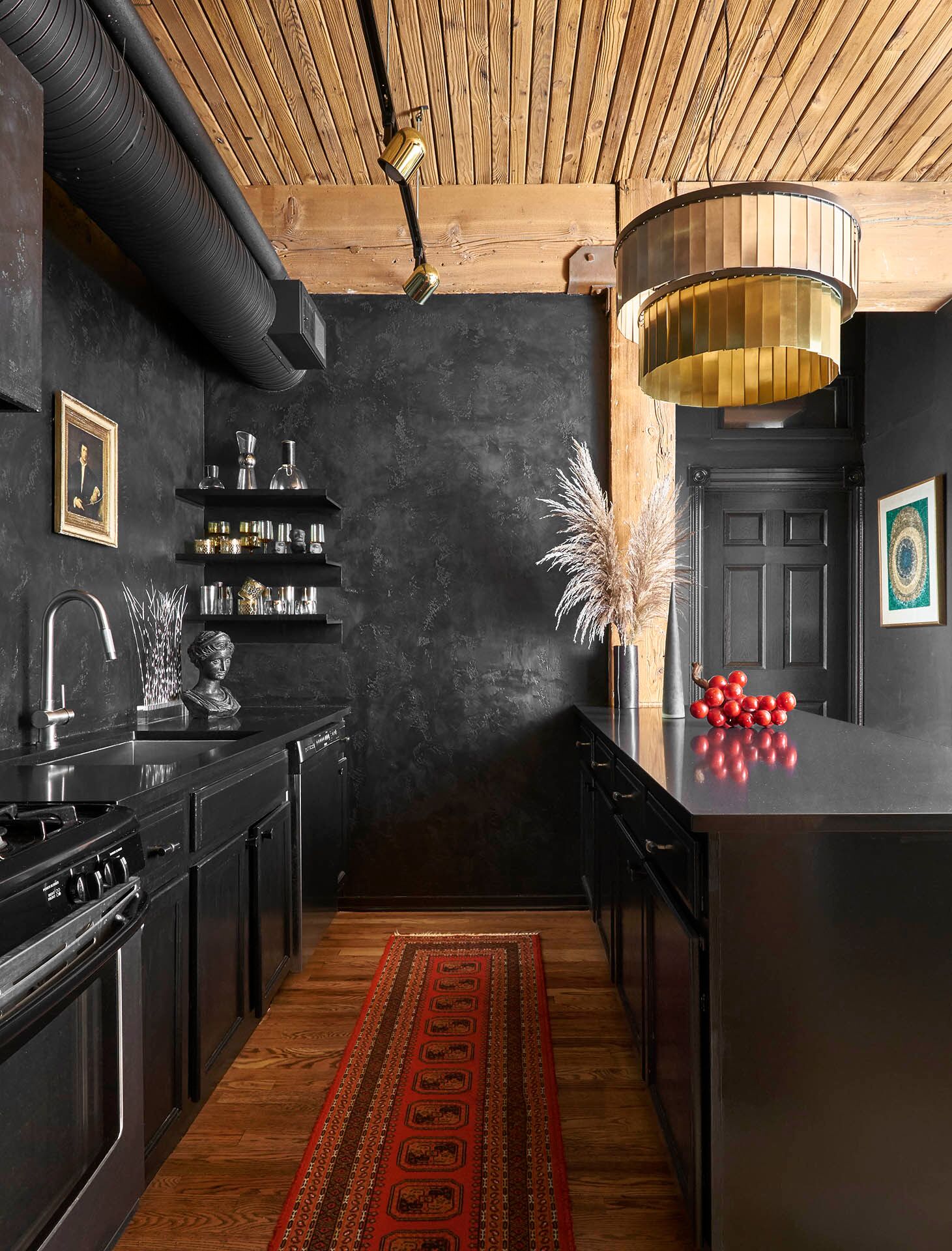
The original kitchen was bad—laminate countertops, dated oak cabinets, and a red accent wall bad—recalls Studio Sven founder and designer director Lauren Svenstrup of the Chicago loft she shares with her husband. The astounding transformation from that to this dramatic space was born from Svenstrup’s affinity for moody tones and a tight budget.
Formerly the site of the Hammon Organ Company, the home was converted into a loft in the early ’90s and hadn’t seen an update since. The wooden beams on the ceiling were an existing part of the layout and served as a jumping-off point for the designer as she took on the reno.
We caught up with Svenstrup to get the scoop on the redesign and the stunning renewal that ensued. Here’s how she got the bold results.

Modify the existing cabinetry
Due to the couple’s limited budget, getting rid of the existing cabinets was not an option. “We took down all the upper cabinets and painted the remaining cabinets black to match the new black quartz countertops,” says the designer.
Svenstrup installed rollout inserts in the base cabinets to make way for more efficient storage and hung a few floating shelves to house glassware. “My husband may never forgive me for getting rid of all his kitchen storage.”
Establish a sense of depth
Svenstrup continued the paint detail all the way up to the 12-foot timber ceilings, completing the look with a fabulous black Venetian plaster backsplash—a technique wherein marble dust and plaster are combined to emulate an illusion of texture.
Paired with the semi-gloss cabinets, the surfaces of the kitchen resulted in an elevated finish.

Rethink the pantry
In lieu of making way for a traditional pantry, Svenstrup sourced a vintage Brutalist armoire and converted it into a storage cabinet for overflow kitchen items. The best part? It keeps the microwave cleverly concealed.

Round it out with pattern
When working with a reserved palette, use subtle prints and understated patterns to invite an added dose of interest. The designer opted for a layered chandelier from CB2 and coupled it with retro brass track lights to illuminate the space. The counter stools, directly below, incorporate subtle pattern, and Old Masters–style artwork underscores the moody vibe.
“I wanted the kitchen to be packed with drama,” Svenstrup explains. “The stark contrast between the adjacent dining room and the kitchen contributes to that. I wanted each space to have a distinct vibe but cohesively play off of one another.”
See more homes we love This Tiny Pink Victorian Might Be the Cutest Home in SF In This Breezy Melbourne Townhouse, Laid-Back Life Is Key This Interior Designer Throws Parties for 80 People in His 480-Square-Foot Studio

