We may earn revenue from the products available on this page and participate in affiliate programs.
Kitchens are debatably the most important room of the house: They’re where we gather morning and night to cook and create. This year, we saw our fair share of inspiring spaces—from the classic whitewashed kitchens that make the case for minimalism to more saturated rooms that prove risk-taking can pay off, our favorite kitchens couldn’t be more different. As such, we’re breaking the best kitchens of 2018 down by color. Keep reading to see which style you like best.
White

Every room of Amanda Dawbarn’s California home emphasizes the abundance of natural light; in the kitchen, it streams through a skylight. Keeping the rest of the space whitewashed (save for a few pops of wood) really plays up that enviable feature.

Erin Kelly is a food photographer, so creating a kitchen that could act as a versatile backdrop for her shoots was of the utmost importance. Clean white walls and cabinetry broken up by wooden countertops did the trick, and to keep it from feeling too sparse, she added trinkets collected over the years to the open shelving.
Wood

Think a small space precludes creativity? Think again: Krissy Jones’s 500-square-foot studio may be small, but it’s packed with character. Raw-looking plywood cabinetry and shelves—coincidentally, one of 2019’s It materials—lends instant charm to her tiny kitchen.

Another example of a perfect rustic room, this Brooklyn home’s kitchen plays up the natural, almost Mediterranean vibe by adding an assortment of collected, mismatched ceramics to the open shelving.
Black

It’s hard to pick a favorite part of Layne Kula’s Denver home, but if pressed, we’d probably say the kitchen. Moody black tiling creates gorgeous contrast against the marble counters and light wood cabinets.

Blue and black may be taboo, but they work beautifully in Paul Bennett’s kitchen. In this space from our winter issue, the two dark colors (coupled with black built-in shelves and darker kitchen tools) combine for a contemporary vibe we can’t get enough of.
Green
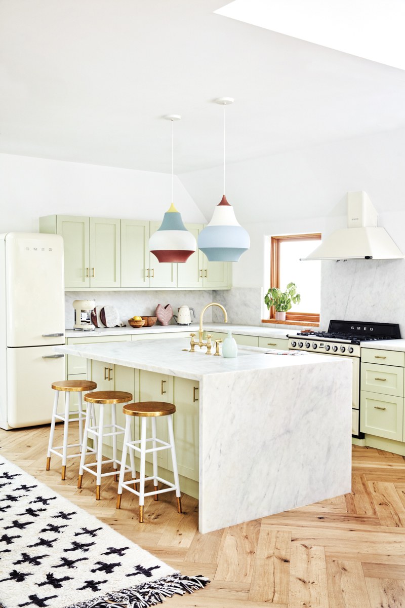
Forget what you think about avocado green: The soft hue is anything but dated, as proven by Lourdes Hernández’s kitchen. She brought it into the 21st century by opting for funky pendant lighting and a sleek marble island.

This custom kitchen was inspired by both West Coast breeziness and Japanese minimalism. Paired together, the simple design really allows the mint green backsplash to take center stage.
Blue

Mediterranean-style tiling makes Jesse Kamm’s L.A. kitchen full of charm—even more so when you consider the fact that she went for a bold cobalt blue in lieu of something more classically California. You’d be forgiven for thinking this space was actually in the Cyclades.

And then, on the opposite end of the color spectrum, sits this saturated blue kitchen. If you subscribe to a maximalist design mentality, try going full monochrome with your color scheme: Everything, from the cabinets to the door to the barstools, is coated in the same hue.
Yellow

This modern industrial Hawaiian home went a bit more unexpected with pale yellow cabinet fronts and countertops, and we’re so glad it did. Balanced out with darker wood and sleek lines, they give an edge to the kitchen.
See more kitchen design ideas: This “Dated” Kitchen Trend Is Back (and We’re Here for it) 10 Kitchens Where the Backsplash Is the Main Event How to Use the Next Big Plumbing Trend in Your Kitchen and Bath
