We may earn revenue from the products available on this page and participate in affiliate programs.
The life of a home editor is both a blessing and a curse: We are exposed to so many talented people who teach us every last detail about how to create the best interiors, but with all that knowledge and inspiration at our fingertips, it’s hard to narrow down the options for our own spaces (or find the budget to bring it all to life!).
Even so, there are a few tips that have stuck with me through nearly a decade of interviewing designers. They aren’t hard rules, but rather guidelines I keep in mind when I’m overwhelmed with choices or can’t figure out where to start. They’ve helped me sharpen my eye and understand why some things simply don’t work together (or why they create the magic we see in magazines). Maybe they’ll help you, too:
Don’t Choose Materials That Weren’t Around in the 1920s
Nate Berkus doesn’t decorate with trends—I’ve learned to avoid the theme altogether with him. But the first time I spoke to him about it, for a renovating story, he said something I won’t soon forget: Your home should include a mix of finishes that have existed since 1920. Time-tested subway tile, marble, painted or wood cabinetry, clay tiles, terracotta, bronze, brass, and stainless steel are all materials you won’t regret a few years after having them installed.
Everyone Glows in a Pink Room
Celebrity designer Kelly Wearstler knows a thing or two about designing a beautiful room and looking great in it. She’s famously said that blush walls are the secret to feeling your best self, which means it’s the perfect hue for a bathroom, bedroom, or even living room if you entertain a lot. Paired with lighting on dimmers, the space will make you appear to glow from the inside out.
Too Many Legs Always Feels a Little Off
Many years ago, I was chatting with interior designer Jamie Meares and she shared a piece of adviceI think of every time I’m picking furniture: Never group too many “leggy” pieces together. For instance, if your coffee table has a very spindly base, the sofa or chairs should be low-slung to make the room feel grounded and not like everything is hovering above the floor.
Every Home Needs a Nook
I spoke to hospitality designer Robert McKinley this summer about his rental bungalow in Montauk, New York, and he summed up the psychological importance of alcoves (and brought me right back to childhood) in two sentences: “I remember when I was a kid, going to people’s homes and finding a little nook. I would think, Wow, what a great area; I just want to get my toys and nestle, read a book, or watch TV here.” Even if it’s just a tiny corner or an especially enveloping chair, creating these cocoon-like moments is soothing, no matter how old you are.
Style Something Until It’s Just Right, Then Remove One Item
This is technically about fashion, but Coco Chanel’s iconic maxim—“Before you leave the house, look in the mirror and take at least one thing off”—applies to design, too. We tend to overstuff our surfaces when less really can be more (not to mention having one less thing to dust!). This is something I reference often when styling a bookshelf or console table; I always omit one vase or tchotchke right at the end.
Viscose Rugs Are Not Spill-Friendly
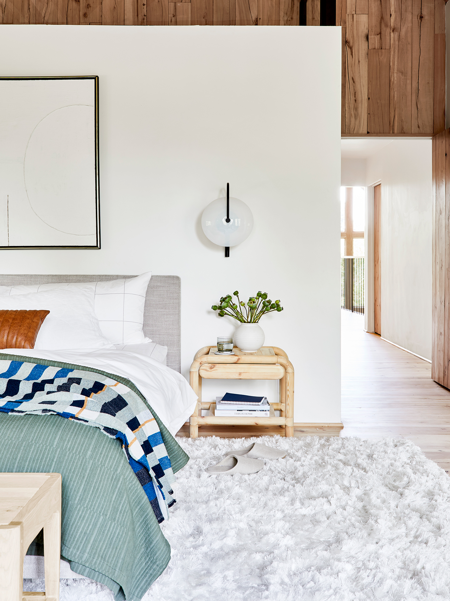
Australian designer Tali Roth happens to have a beautiful white rug in her house—and two small children. I had to ask: How does she keep it clean? It’s all in the composition, and she warned me against viscose fabrics: “If you spill anything on it, like a glass of water, it shrivels,” she explained. I had a similar rug that suffered a few water and wine tumbles, so I looked at its composition when I got home. Lo and behold, it contained viscose. Choosing a material like wool or silk might be more expensive at first, but it’s worth the splurge when you don’t have to replace your rug after only a few years.
Every Room Needs a Touch of Black
Designer Jan Showers once said that every room needs a touch of black, just as every room needs at least one good antique, to give it character. You can spot this thinking in my own interiors, even if it’s something as simple as a line drawing or an inky table-lamp base.
Now that you have these tried-and-trusted design rules in your arsenal, feel free to go out and break them. (Isn’t that what they’re for?)
More decorating ideas to try right this way: The Brits Have a Shelf Just for Cheese in Their Kitchens This Once-Boring Color Is Getting a Rebrand (And We’re On Board) The Decorating Lessons I’ve Learned From Moving 12 Times in 12 Years
