We may earn revenue from the products available on this page and participate in affiliate programs.
Liubasha Rose had just four months to whip a shingled Bedford, New York, house into shape for a family of seven before move-in day. Luckily the interior designer and founder of Rose Ink Workshop is used to tight timelines, thanks to her work on hospitality properties ranging from the 1 Hotel in Miami’s South Beach to the Well fitness club in New York City. It also helped that she had interior designer Kirby Redding as a sidekick on the project and that the house was in good shape.
“The bones were really nice, and there were beautiful architectural elements, but it didn’t feel cool,” says Rose. Instead of ripping up all the orange-toned ’90s wood and starting from scratch—the schedule simply didn’t permit it—she made a snap decision that would dictate the whole design: glossy white floors. “It created this blank slate where we could play with everything else,” she notes.
Making First Impressions Count

Upon entering the front door, you were met with a honey-hued staircase that wrapped around to the second floor. Rose knew she’d have to come up with a clever treatment here, too. Instead of painting the whole thing white to match or going with a contrasting color, she opted for a dramatic blue ombré effect on the spindles, which goes from light to dark up the steps. “We took five paint decks on-site and did some tests under natural light at different times of the day,” says the designer. A mix of six shades from different brands left them with the perfect gradient.
Erasing the Builder-Grade Vibe

To give the rest of the ground floor some much-needed character, Rose lined the living room and kitchen walls with local, reclaimed railroad beams. “They’re these really fun, rustic portals, which are a very nice offset against the white,” she says. A chunky stone fireplace mantel mimics the wood framing.
Keeping Things Kid Friendly


In the kitchen itself, Rose only had to switch up the light fixtures, paint the island base white to match the rest of the space, and build a breakfast nook to fit the large family. The children rule in the adjacent living room, too: The sofas are stainproof and the round ottoman creates a soft landing for five kids bouncing everywhere. Their play tent, which could have been plucked from an enchanted forest, was a labor of love. Starting with a simple canvas frame, Rose spent five hours hot-gluing ferns to its exterior.

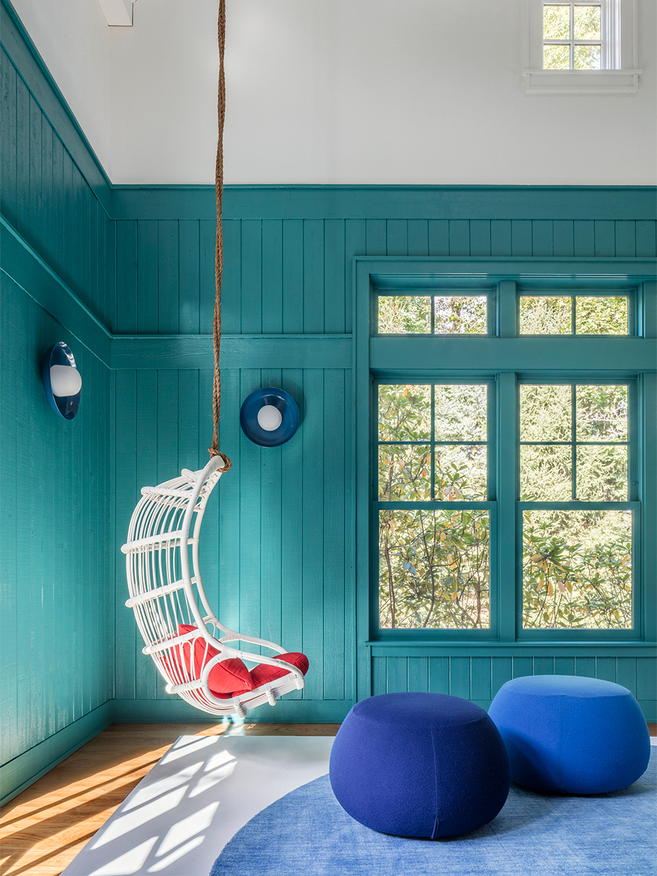
Childlike features only multiply in the playroom: foam tile and round rugs (double the padding), swings hung from the ceiling, a mini crafts table, and plush poufs that can easily be moved out of the way. “It’s bouncy so the kiddies can jump around, and it’s comfy,” says Rose. With its white rafters and teal walls, you’d never guess the space was once covered in dark wood paneling.

Rose continued the turquoise hue into the den, where a surf-themed wallpaper is framed with a Century Paint hue by Benjamin Moore. “It has this really nice velvety quality, so we put it on the ceiling and the trim,” says the designer.
Creating Fantasy Lands


Three bedrooms round out the kids’ quarters. The twin boys’ safari space is complete with tented beds and a world map wallpaper depicting all sorts of animals. In the girls’ room, four-poster beds serve as a structure to hang twinkly string lights. “They glow in a variety of colors and you don’t see any filaments,” says Rose. But perhaps the most cocooning of all is the nursery, where the designer picked an ombré wallpaper with matching floor and ceiling paint to set a calming tone for breastfeeding.
Giving Adults a Space, Too

The grown-ups got a hangout of their own in the loft above the garage. The wood beams and floors were a softer, less yellow shade, so Rose kept them as is and stained just the horizontal wall beams for contrast. The family opted out of a TV in the den to keep the kids off screens as much as possible, so the loft doubles as an at-home theater, games space, and makeshift workstation—it is 2020 after all—thanks to a well-positioned desk with a view. Not a bad commute.

The Goods:
Favorite local home store: Home Nature.
Go-to online home site: Serena and Lily.
Thing in my home that gives me the most joy: Fresh flowers every week.
My biggest splurge: A baby alpaca throw blanket.
Who to Know:
The nicest contractor I’ve ever met: Eddie Major of PM Construction.
Genius landscape architect: Mario Nievera of Nievera Williams is the best.
Meticulous wallpaper installer: Esther Calderon Interiors.
Other highly recommended craftspeople: I loved working with Alternative Contractors. Derek Shambora and his team of artisans can do anything with concrete and plaster.
The one thing I wish I knew before renovating: If I could go back in time, I’d redo all the outlets and switch covers.
Our Winter Renovation issue is here! Subscribe now to step inside Leanne Ford’s latest project—her own historic Pennsylvania home. Plus discover our new rules of reno.
