We may earn revenue from the products available on this page and participate in affiliate programs.
When Sara Oswalt of Purveyor Design first walked into this sprawling 1960s East Hampton house, it had been meticulously renovated but was bathed in coastal blues and nautical nods—a fitting theme for a beach retreat, but perhaps an overly obvious one. Designed as a weekend home for a couple in their 40s, the five-bedroom, five-bath house had all the makings of an idyllic Long Island summer abode: a shingled exterior, a pool house, two fireplaces, and tons of natural light; it just needed a push in the right direction.
Despite the picturesque setting, an extensive renovation process had left the couple disenchanted, and they needed a fresh pair of eyes to make the space feel like a home in time for their newborn’s arrival. That’s when they called on Oswalt to help infuse it with a warm and layered feel. “The idea was to create something that felt beachy and casual but elevated and different and wasn’t afraid to mix,” the designer told Domino.
To step away from the coastal theme that swathed the home, Oswalt focused on creating a space that effortlessly mixed Scandinavian vintage modernism, Japanese hints, and traditional elements. Here’s how she layered history into the seaside retreat:
Step Away From Clichés


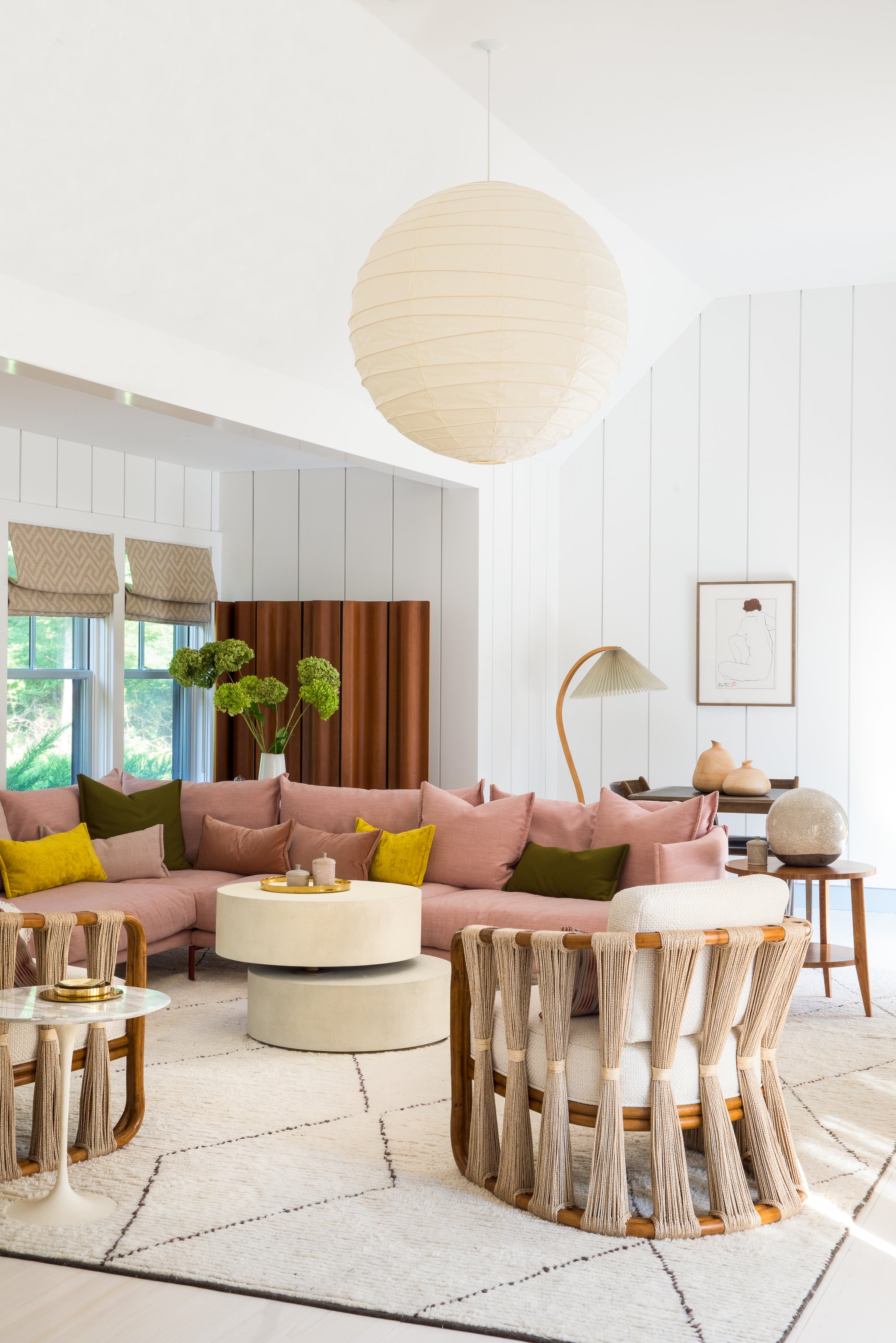
A beachside home doesn’t need to be filled with starfish accents and boat anchors. Oswalt worked on infusing the space with warm colors. “I struggled with finding a way to remind guests that they were at the beach without using clichéd beach-house things,” she says. “We wanted a colored sofa, and I desperately wanted to stay away from blues, since they were already in most of the house, so we ended up going with pink.”
Add Lots of Soft Textures

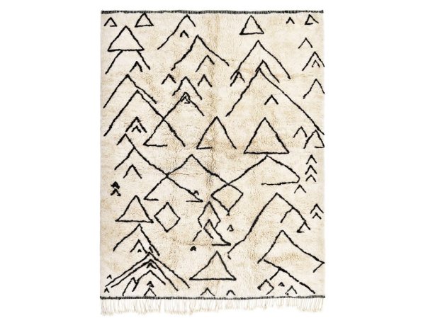
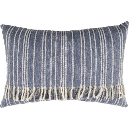
To warm up all the cool tones, Oswalt brought in tons of soft furnishings and textured pieces. She started with a custom Berber rug for the master bedroom and went all out from there. “My clients jokingly asked me afterward how many pillows they now had throughout the house, and it made me laugh. I think it was upwards of 60,” she remembers.
Introduce Vintage Pieces


After those softer items, the next order of business was corralling as many vintage pieces as possible to make the home feel more collected. Luckily, her clients already had a few key items—a secondhand, never-used custom tufted sofa, for example, and a Broyhill dresser that Oswalt moved to the reading room. To finish off each space, she brought in small accessories and ceramics: “I came from a career of styling photographs first, so I have to admit that I am different than most designers in that way—I am a huge sucker for little things.”
Layer a Large Space Until It Feels Cozy

One of the biggest challenges was the great room. “It was very vacuous, so it was tricky to take the layout and turn it around to make it work,” explains Oswalt. Being in the center of the home, the area is often used as a walk-through, but it still needed to feel comforting. The solution? She started with the pink sectional and added window treatments, rugs, and Japanese-inspired Palecek chairs upholstered in a Pierre Frey cream fabric.
Pay Attention to Lighting


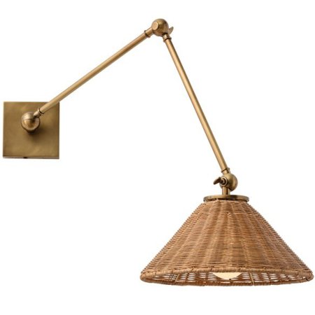
One thing that’s a constant throughout the home is a selection of great light fixtures, starting with a Noguchi pendant that the client had already purchased. “We hung it in a way that lets the ceiling glow at night and brings your eye up,” says Oswalt. She layered the room with a Le Klint–inspired accordion standing lamp that she found on Chairish. “It has a Scandinavian flair but with a hint of Japanese and French,” she notes. But if she had to pick, her favorite item is a bit more unassuming. That honor goes to the pair of Lostine leather sconces that flank the master bed. They prove once and for all that great lighting really can transform a room.
Get the look:
Step inside more homes we love: In This Breezy Melbourne Townhouse, Laid-Back Life Is Key This Farmhouse Fixer-Upper Casually Has a Half-Pipe in the Barn This Surf-Inspired Bachelor Pad Is a Master Class in Custom Renovations


