We may earn revenue from the products available on this page and participate in affiliate programs.
There’s a world of bathroom sink silhouettes out there (pedestal, under-mount, vessel, bucket), yet when it comes to material, they all tend to be made out of the same thing: slippery white ceramic. It’s easy to clean, sure, and you can’t call it an eyesore, but when was the last time you got excited about the basin style? Things are looking up, as this space is experiencing a big change, and—to no one’s shock—it’s partially farmhouse inspired.
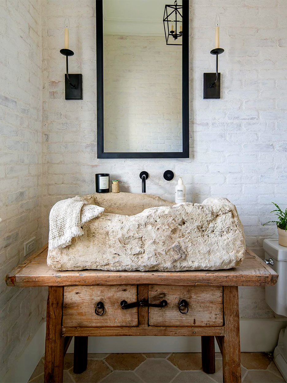
We’re currently seeing antique stone sinks pop up in bathrooms and powder rooms everywhere. The go-to choice among designers like Kelly Nutt (see her space, above) appears to be limestone: a durable, readily available (read: cost-effective), and easy-to-clean option. However, weighing in at hundreds of pounds, these heavy troughs—whether marble, limestone, or travertine—do require a sturdy support system. Nutt cut down the legs of an old console table and used that for her foundation. The raw, almost Brutalist quality to these statement fixtures is worth giving up sleek porcelain for good.
If You’d Rather Be at a Country Cabin

The sandy ecru undertones of limestone play nicely with the oak panels that cover the walls of this Ashe Leandro–designed space. Both of the features were sourced from Chateau Domingue, a Houston-based company that sells architectural antiques, including reclaimed wood and stone salvaged from demolished forts and castles across France, Italy, Belgium, Portugal, and Spain.
If You’re Feeling Gothic

“In a small space like a powder room, the details count,” says designer Amber Lewis of her decision to go with a reclaimed stone sink in this space. The wide trough provides a nice contrast against the textured charcoal walls. But when you want to mount something this massive, you’ll have to get your contractor to go the extra mile and weld a steel frame system into the wall.
If You Won’t Desert Your Minimalist Roots

Turkish hammam sinks feature a charming silhouette. (Nate Berkus, who had one in his former L.A. home, referred to the little wings as ears and said it was his favorite invoice from his renovation.) The tones of the stone backdrop emphasize the room’s monochromatic look, “fostering depth without overpowering the space,” says its designer, Tamsin Johnson. The heavy lifting is worth the final result.
Our Fall Style issue has arrived! Subscribe now to get an exclusive first look at Ayesha Curry’s Bay Area home—and discover how design can shape our world.

