We may earn revenue from the products available on this page and participate in affiliate programs.
Known for its curated collection of paint colors and high-quality supplies, Backdrop is putting down the foam roller (for now) and picking up a smoothing tool. The millennial-favorite company (already with Madewell and Coming Soon collaborations under its belt) just launched its first collection of wallpaper. Schumacher, which acquired the DTC brand last May, will also carry the patterns as part of their collections.

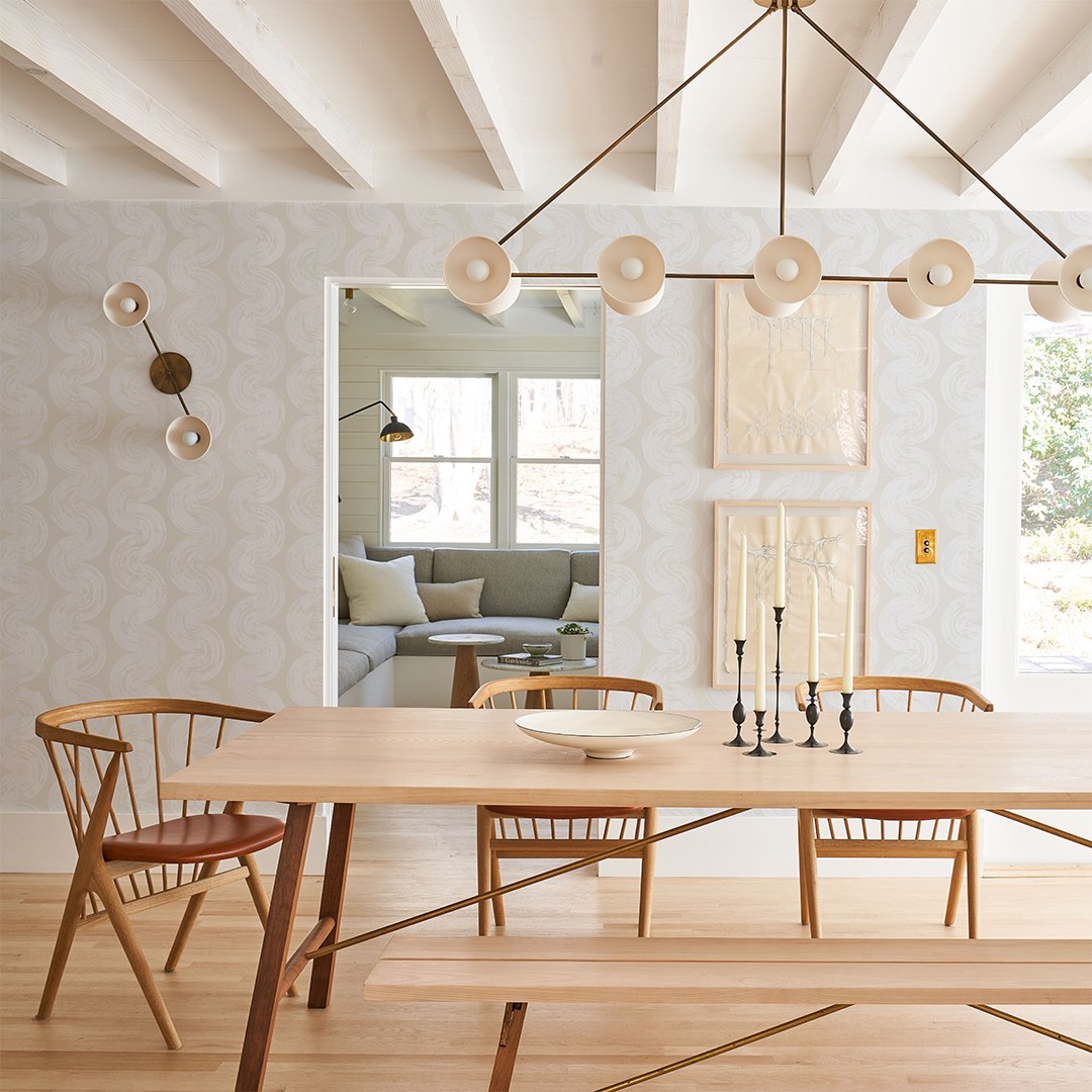
What will expand as a seasonal drop starts with Backdrop 1: five patterns that were designed in founders Natalie and Caleb Ebel’s downtown Los Angeles studio. The graphic designs, digitally printed in Brooklyn, originated as hand-drawn or cutout geometric prints. Of course, it wouldn’t be Backdrop if the wall treatments didn’t perfectly coordinate with some of its most popular shades, and we have a few ideas for how to pair each style.
If You Like Tan Lines, Try White Lotus
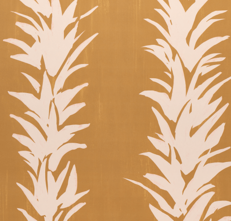
Backdrop’s take on a botanical motif, White Lotus (not to be confused with the buzzy HBO show) was drafted by cutting out angular shapes on construction paper. We see these mustard yellow stripes in a powder room, with Tanlines used on the baseboards for an all-enveloping, dramatic effect.
If You like Moonlight, Try Hyperion
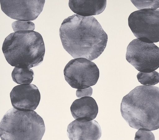
Subtle and soft (the motif was created through an ink-wash process), the large blobs are easy on the eyes. Showcase the print’s grandness by swathing your dining room in the organic circles, then coat the ceiling in the brand’s warm off-white to really call attention to the high-contrast treatment.
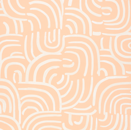
If You Like Earthly Delights, Try New Beat
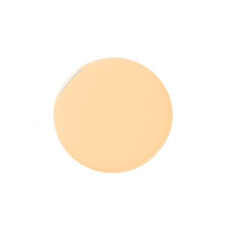
Cheerful and light, New Beat was influenced by the movement often seen in iconic works of Abstract and modern art. The peachy background would lend a lot of joy to homework (or just work) time, so use it to brighten up an office or teen’s room. Save the coordinating paint color for the door so you feel a jolt of happiness the second you walk in the room.
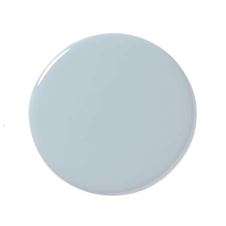
If You Like The Early Stuff, Try 1975
Inspired by, you guessed it, the groovy energy of the 1970s, this pick brings a 2022 color palette to the era’s signature curved shapes. We picture this winding design adorning the walls of a nursery, while one can of the cool blue-gray paint can be used to transform a plain wood dresser–slash–changing station into something special.
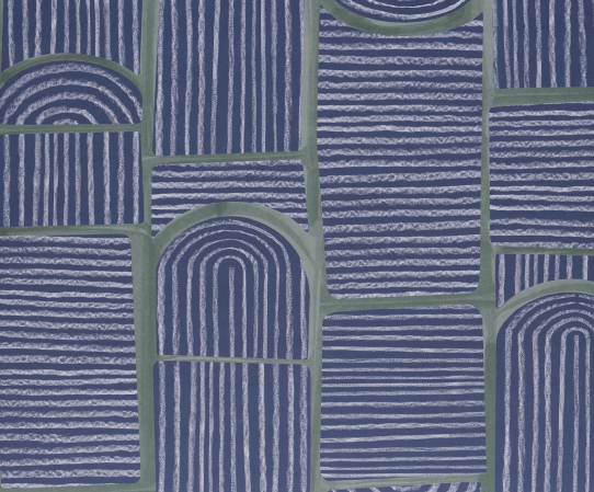
If You Like Weekend Upstate, Try Bloomsbury
Bring London’s Georgian architecture home with multidirectional arches. The moody combination of navy and olive green is ideal for a den or movie room (really anyplace you want to indulge in darkness). If there are any windows in said cozy space, swathe the trim in dark green to achieve cocoon vibes.
