We may earn revenue from the products available on this page and participate in affiliate programs.
We’ve all got that corner in our closet that’s stacked high with dusty leftovers: spare tile, oddly shaped wallpaper remnants, and, of course, lots of paint samples. A little voice in our head tells us they may just come in handy one day. Spoiler: That day is today.
In a flash you can use those forgotten paint testers, specifically, to create a dynamic backdrop for your most-prized artwork. All you have to do is tape off a square, slap on a coat or two of your favorite shade, and rehang your collection. The low-lift DIY is great for both those who love color but don’t want to go gaga and commitment-phobes (it’s easily reversible). Better yet, the clever trick can quickly solve a few common design challenges—more on that, below.
Unite Your Gallery Wall by Coloring Inside the Lines
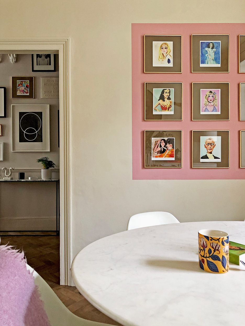
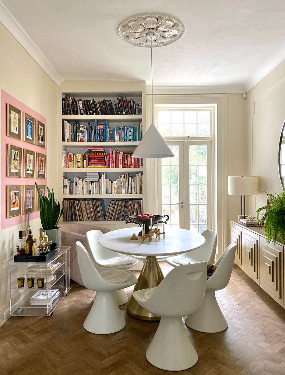
It’s easy for gallery walls to feel haphazard. Add cohesion to yours by corralling it in one hue à la this pink option in blogger Bianca Hall’s dining room. The backdrop tempers the grid created by each frame, allowing you to absorb the installation as a whole. In short: It helps the pieces hang together, pun intended.
Beef Up a Piece With a Big Border
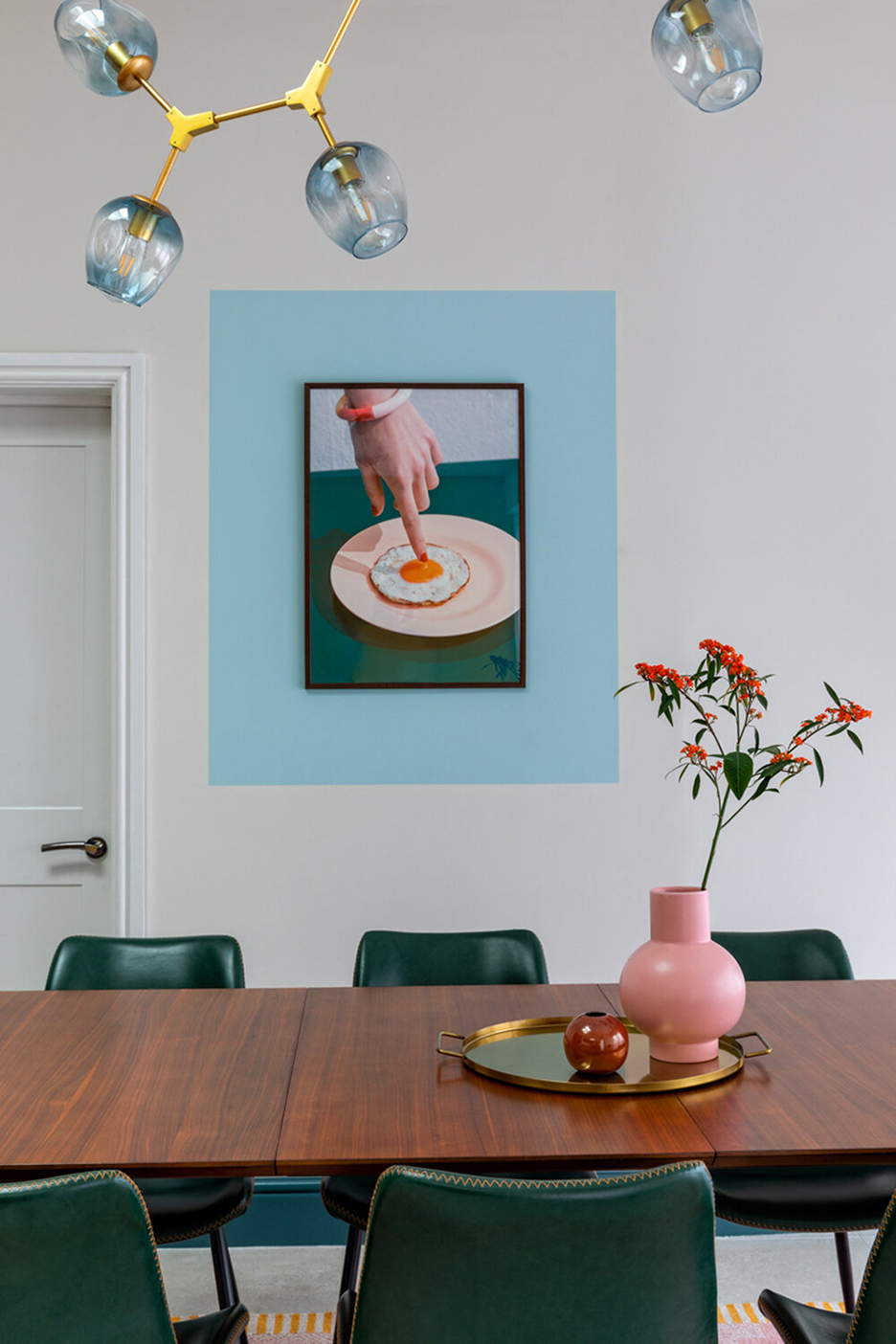
Artwork not quite filling up your wall? Emma Gurner’s been there. When this quirky print from the The Paper Collective arrived on the designer’s doorstep, it was smaller than she’d anticipated, so she used a lick of aqua to extend its borders—read: make it look bigger. A level and painter’s tape helped her achieve those perfectly crisp edges.
Add a Glossy Finish to Lighten Up a Dark Corner
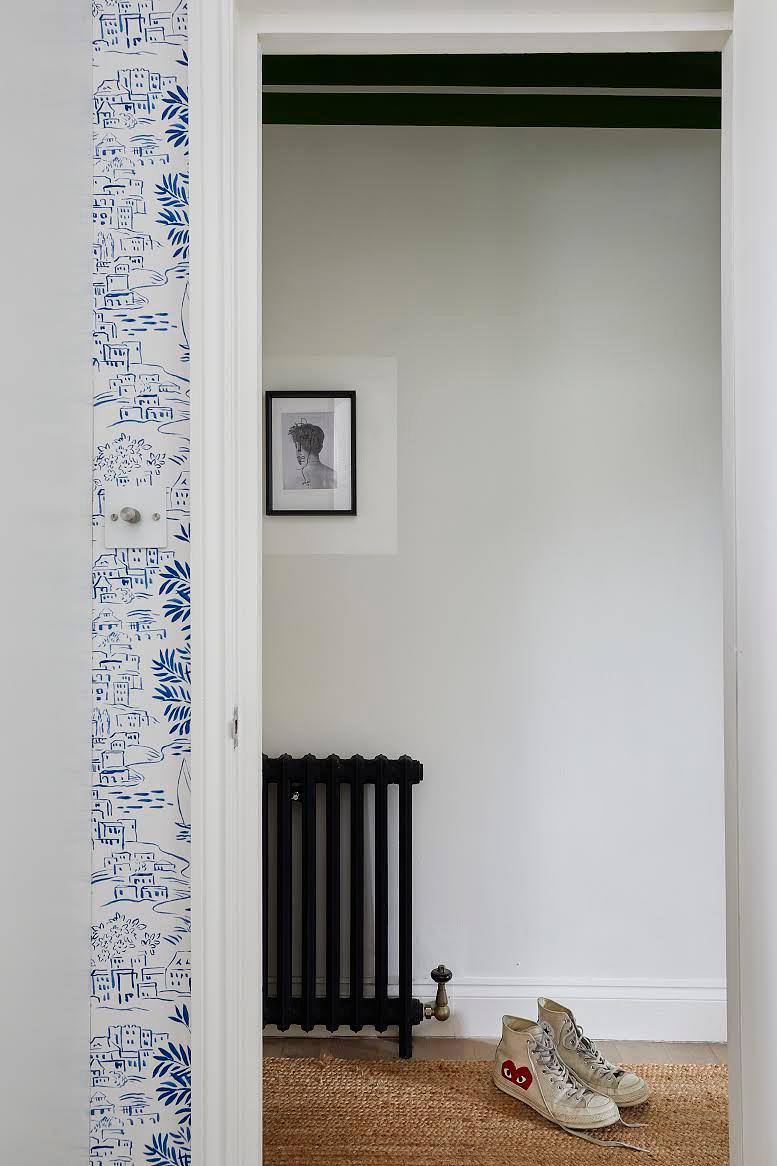
If your artwork is decorating a dimly lit room, follow designer Andrew Jonathan Griffiths’s lead and frame it with high-gloss paint; the reflective finish will bounce some much-needed light around. Bonus: Griffiths’s subtle, tone-on-tone approach brings depth and interest to a petite space without overwhelming it, making it a smart solution for halls, powder rooms, and entryways.
Keep It Simple by Letting Your Art Pick the Hue for You
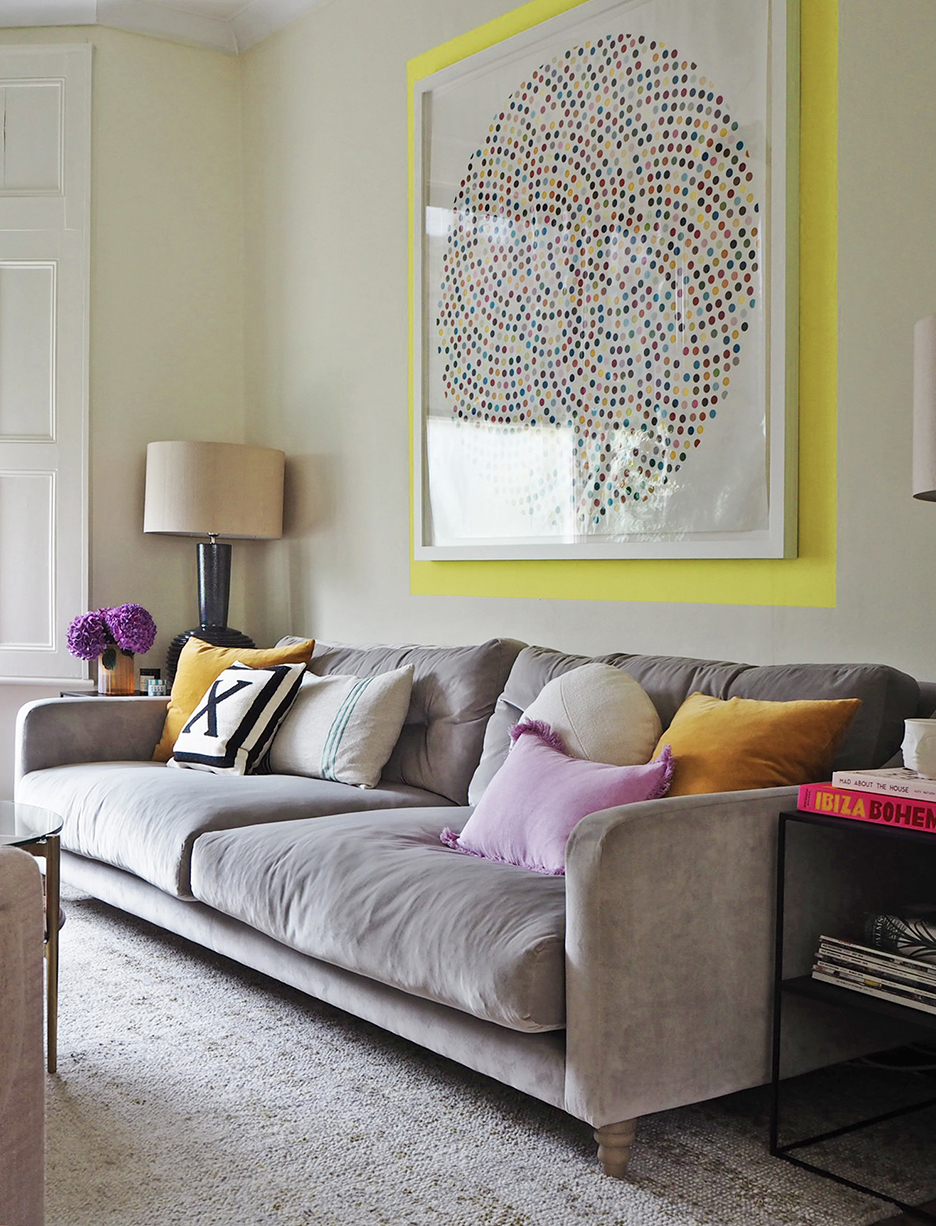
To ensure your backdrop won’t upstage the art it surrounds, sample a shade from the piece itself so they play off one another. If you’re still worried about the color hogging the spotlight, keep things subtle by reducing the width of your handmade frame. A little neon yellow goes a long way.
Our Winter Renovation issue is here! Subscribe now to step inside Leanne Ford’s latest project—her own historic Pennsylvania home. Plus discover our new rules of reno.