We may earn revenue from the products available on this page and participate in affiliate programs.
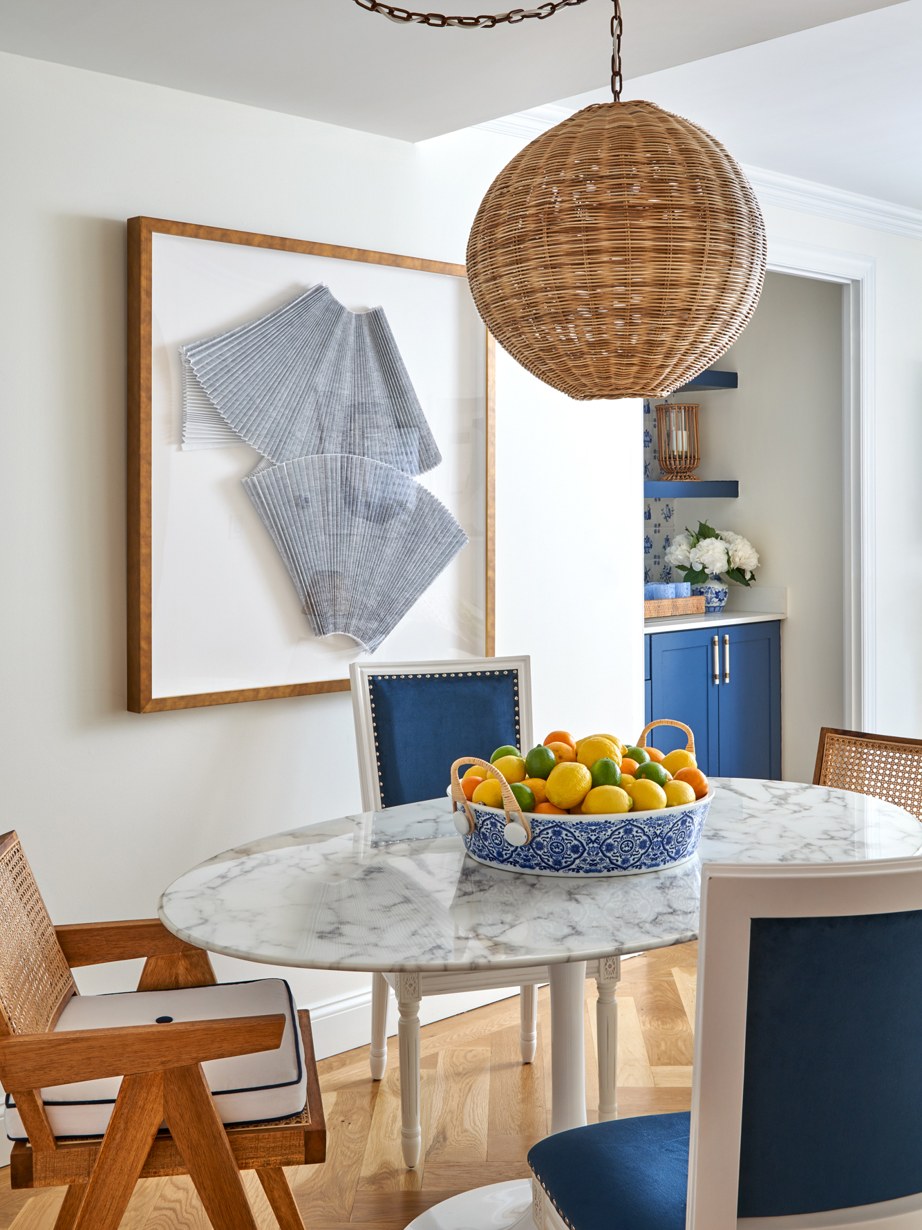
Judging from the color-coordinated, Scalamandré-wallpapered wet bar that separates the dining room from the living area in Ariel Okin’s Upper East Side apartment, you’d never guess this was a rental. But that’s exactly what it is. Clearly, the 28-year-old interior designer has a few tricks up her sleeve for making a temporary space feel custom—whether it’s her own or that of a famous actress. (Her latest project: Lena Dunham’s Manhattan home, another rental, which graces the cover of Domino’s Fall issue.)
Okin, who shares the home with her husband, Ben, and their goldendoodle, Charlie, found out she was pregnant just three weeks after moving in. With a new addition to the family due any day now, stumbling upon this three-bedroom spot when they did felt like a blessing in disguise. After discarding their post-college mismatched furniture, Okin got to work decorating their new apartment, rethinking every nook and cranny. That fancy wet bar? “It was just a closet with a random sink in it,” Okin explains. “I took the doors off and turned it into a conversation piece. It flows really nicely for entertaining; we love to cook and have people over.” Here, she shares more tips for personalizing a rental:
Know What Details to Look For

“When I saw this listing last October, it only had one small distorted picture of a linen closet—no other photos or even a floor plan,” Okin remembers. Still, the description was promising: The place was in their price range and had three bedrooms to accommodate both their growing family and an office. She called the broker immediately.
They were met with way too many dark gray walls, but Okin knew she could make the home feel breezy and light with a little paint and the right textures. Most important, the prewar apartment had tons of charm—think: crown molding and herringbone floors—as well as nice-to-have upgrades, like a new kitchen and bathrooms. “The owners did a really great job of picking classic, timeless finishes for those spaces, and put a lot of thought into the little things like doors and moldings,” says the designer.
Start With a Blank Slate

The only things that came with them for their old apartment? Artwork. A vintage photograph from the ’60s of a beach in Florida where she vacationed as a kid; pieces from artists Jessalyn Brooks and Dawn Wolfe; and a mini version of the large work that used to hang in the lobby of the Carlyle Hotel, the couple’s favorite date spot, all made the cut.
“I was eager to start from scratch when we moved uptown,” says Okin, “so we really started from zero, down to the bedding from Matouk, when we settled into this place.” She didn’t decorate all at once, though. Instead, she took the time to understand how to maximize the narrow layout and small bedrooms. “It was a labor of love,” she says. “I had no furniture in my office for months!”
Stay True to Your Own Style

Dunham’s home is all patterns and pastels, but the designer’s own space skews more traditional. Her favorite designer, Billy Baldwin, said it best: “Be faithful to your own taste because nothing you really like can ever go out of style.” For Okin, this translates to classic patterns mixed with modern art, chinoiserie, and natural fibers. “Following trends can be tricky. If you stick to your core aesthetic, no matter what it is, your personality shines through,” she says. “Those types of spaces are the most interesting and authentic.”
Choose a Calming Backdrop

The apartment doesn’t get much sun, so brightening it up was a must. “I love the way West Coast homes seem to just ooze natural light, particularly that Santa Barbara, Montecito vibe, so I tried to bring a little of that to the Upper East Side,” says Okin. Various shades of blue, fresh flowers, and natural textures like bamboo and rattan mingle with crisp, tailored pieces.
In the living room, she went neutral on the bigger surfaces—a nubby ivory sofa and Wimborne White paint by Farrow & Ball on the walls—and layered in prints and textures with the pillows, art, and accessories. “Living in the city can be stressful at times, so I wanted the space to serve as a blank canvas for inspiration for future projects without being too busy or distracting,” explains Okin.
Stay Superintendent-Friendly

While the couple couldn’t renovate, they wallpapered, painted, swapped out light fixtures for new ones from Hudson Valley Lighting, and installed custom window treatments from The Shade Store. (The office boasts a ticking stripe wall covering; the bedroom features grasscloth.) “We basically did as much as any person could do to a rental in New York without getting yelled at by the super!” says Okin, laughing.
Of course, the changes have only just begun. The closet–turned–wet bar’s current role might be to house the designer’s vintage blue and white ginger jars, but we see many rounds of cheers to the arrival of Baby Okin in its future.
Browse more homes we love: Lena Dunham Finds Her Happy Place IKEA-Meets-Gufram in This Playful Family Home Hillary Kerr’s Silver Lake Bungalow Is a Master Class in Repurposing Vintage Finds
