We may earn revenue from the products available on this page and participate in affiliate programs.
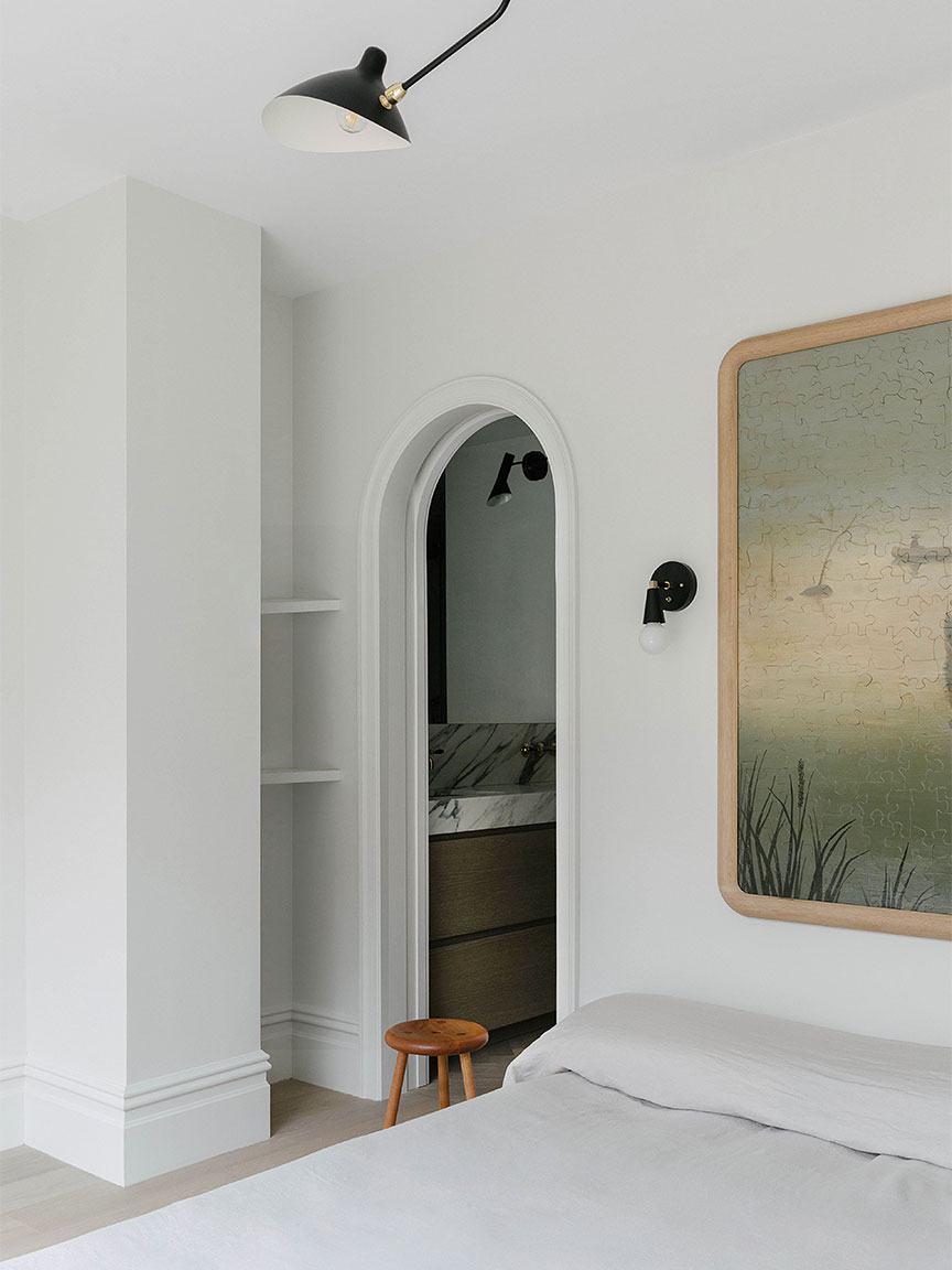
You’d think something as ubiquitous as the arch wouldn’t be able to get any better, but this past year we’ve learned there’s always room for improvement. In 2019 we saw designers beginning to experiment with the timeless silhouette in the form of mirrors, headboards, shower openings, and windows. Now we’re seeing the trend translated to wall niches and murals. But will the arch mania last?
While it sounds like the prized architectural detail will always be at the forefront of designers’ minds—they’re “here to stay,” says Jordan Cluroe, one half of the firm 2LG Studio—they have their sights set on what’s next. Hoping to catch a glimpse of the future, we asked five industry insiders to identify other silhouettes and thresholds they’re seeing now. Bookmark these ideas for 2021.
Circles

Arches aren’t going anywhere, according to Cluroe, but he does suspect the shape will only become more organic. “Circles are so comforting,” he says, adding that he’s currently got his eye on curved chrome furniture from the ’90s. A round window at the end of a hallway or polka dots painted onto a garage soothe the soul.
A Fresh Lining

Designer Jae Joo isn’t ready to say goodbye to arches completely, she just wants to give the thresholds some extra definition. Balancing the smooth lines with edgier materials on the inner radius, like brass or tiles, will make the shape feel new again. “I also love ones that are dramatically wrapped around in marble or wood,” says Joo.
Human Forms

“The body is hot right now,” says Kinder Modern founder Lora Appleton. What started with boob decor (remember Cold Picnic’s viral rugs and bathmats?) has evolved into a full-on design movement that encompasses lamps with faces and coffee tables with lifelike legs. “Now is the time to celebrate being individual,” says Appleton. Imagine doorways carved to look like your own outline.
A Renewed Focus What’s Underneath

New York City–based designer Tali Roth wants thresholds and built-ins to share their spotlight with the floor. “I’m seeing lots of fabulous mixtures of materials when it comes to flooring,” she says. Checkered tile next to wood; oak paired with brick; painted planks colliding with terracotta—the combinations are endless. “It ensures that the foundation of a home is thorough and solid,” says Roth of paying equal attention to the main features in a space.
Getting to the Point

Designer Claire Thomas has been looking to the past lately for her projects, including this recently renovated Airbnb in California’s Yucca Valley. “I’m a history nerd,” she says. “I’ve recently been focused on the Middle Ages, so I’ve become obsessed with gothic lines.” The key to pulling off a medieval detail like the pointed arch is mixing elements from other eras and places (in this bathroom she brought in a Tudor window from the 1920s and clad the walls in a Moroccan-inspired tile). Look inside her crystal ball and you’ll also find buttresses and domed ceilings.
Introducing Domino’s new podcast, Design Time, where we explore spaces with meaning. Each week, join editor-in-chief Jessica Romm Perez along with talented creatives and designers from our community to explore how to create a home that tells your story. Listen now and subscribe for new episodes every Thursday.

