We may earn revenue from the products available on this page and participate in affiliate programs.
When photographer Alpha Smoot and her husband, Zach, bought their townhome in the Bronx in 2020, the first order of business was to create a blank canvas. “The entire upstairs was electric blue and the whole first floor was yellow,” says Smoot, laughing. “We had to use special color-block paint to go over the blue because it was so intense.” Since it was the early days of the pandemic and easiest to buy five-gallon buckets of white paint, they opted for neutral walls throughout. But returning their home to a simpler state made Smoot crave color—even if she was hesitant to embrace saturated surfaces again anytime soon, especially in her now 3-year-old son Harlow’s room.

With a crib and little else, the nursery was decidedly minimalist. Smoot hoped to create the ideal toddler space that could transition to a big-kid room, one that Harlow could navigate on his own to foster independence. She wanted vibrancy and distinct design, but without the commitment of a wall color or pattern just yet. So she called on her stylist friend Cecilia Elguero, who moonlights as an interior designer, for help brainstorming decor solutions.

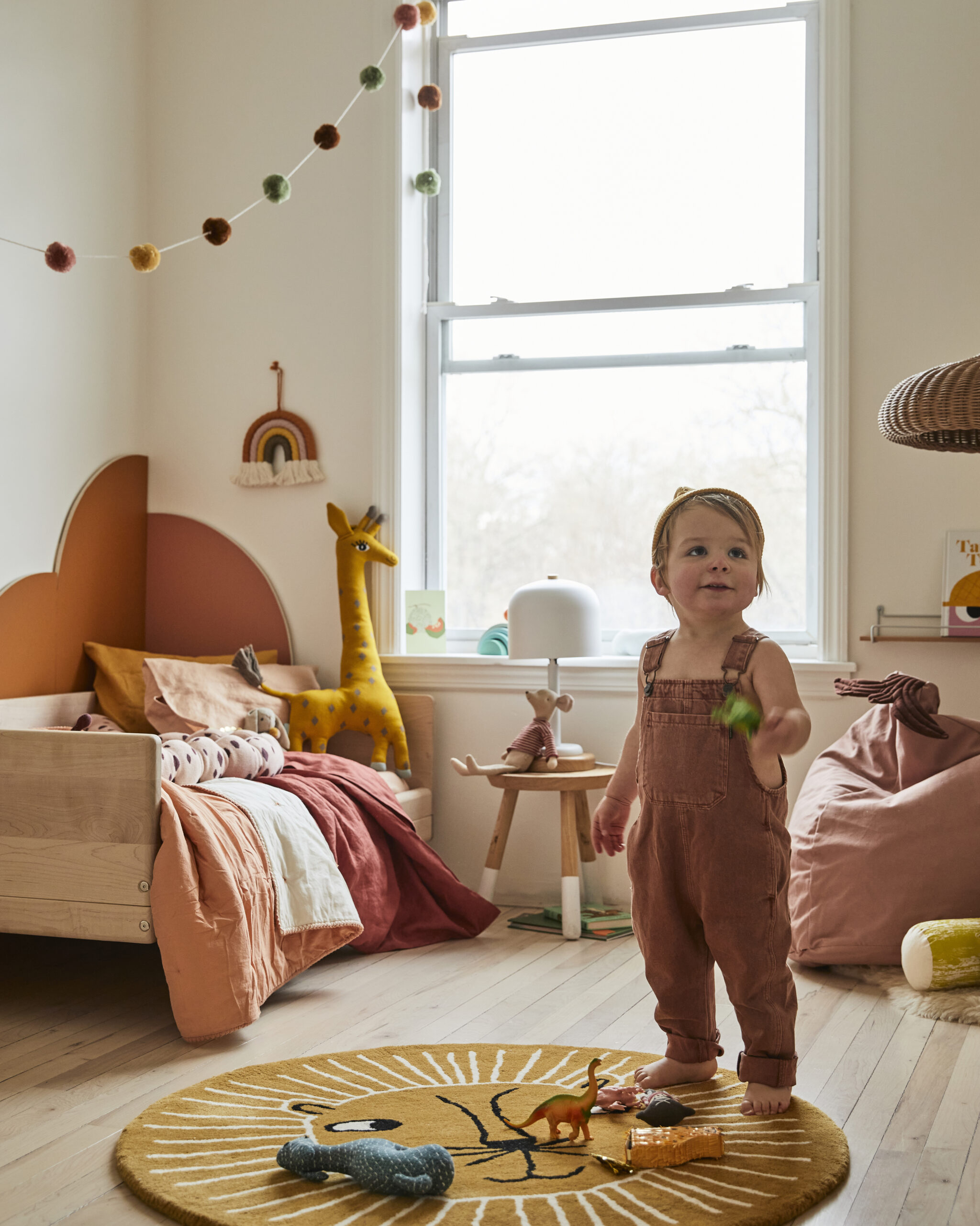
Elguero often designs sets for her work and quickly realized they could introduce color the same way she would at a photo studio: with movable, painted wall panels crafted from plywood—a concept she used successfully while decorating a room for her sister. “We liked the idea that it could be modular and provide possibilities of change over time as Harlow grew,” says Elguero. She and Smoot thought arches would be especially cute, as they subtly suggest rainbows.

The shape sparked the direction for the rest of the interior: Arcs are now threaded throughout the room, including a rainbow wall hanging, a roundeded bookcase from Crate & Kids, and even a rainbow stacking toy.

Next, the women collaborated on mood boards for the palette and smaller touches. “I really loved the sunset tones that were appearing in our inspiration images,” says Smoot. “I liked the idea that it could be fairly monochromatic but still give us a lot of options to play with.” She also opted for a low-slung Kalon Studios daybed for easy climbing on and off, and Elguero curated a selection of cozy sheepskins and playful pillows for a reading nook. Both the bed and book corner are defined by the arches, creating rooms within the room.

Elguero cut the panels in her studio with a CNC machine (you could do the same with a jigsaw). “You can see the layers of the plywood on the edges—I love that detail,” says the stylist, who chose a furniture-grade type for its supersmooth surface, though regular plywood or even medium-density fiberboard would be a budget-friendly alternative. Then she painted just one side of each piece in case Smoot later wanted to use the other for a more neutral look. Once the arches were ready, Smoot and Elguero played with them in the space, arranging different pieces together until they got a just-right composition, and used heavy-duty self-adhesive Velcro tape to affix the panels to the wall.

Perhaps the greatest result of their collaboration? “Harlow still spends most mornings flipping through books in the reading corner by himself before we wake up!” says Smoot. Talk about a pot of gold.
