We may earn revenue from the products available on this page and participate in affiliate programs.
As one of the oldest cities in the U.S., Philadelphia has no shortage of historic rentals. It is, however, a bit tricky to find one that suits a modern lifestyle, as creative consultant and interior stylist Alexandra Morris Flint came to find while apartment searching in winter 2018. “There are so many charming townhomes here that you can actually afford to rent; they’re like tiny jewel boxes,” she says, but adds that’s part of the problem—most are shoebox small or, in the case of her 6-foot-plus-tall husband, a tad too short.

Although the couple had their hearts set on something with a bit more character, the city’s row homes proved to be a little cramped, especially compared to the first place they visited with its 14-foot ceilings and oversized windows. “Because it was the first lease we saw, we really didn’t think it was going to be our apartment,” recalls Morris Flint. “But neither of us had had that kind of light before, so we were totally taken with the idea.” Its historic exterior certainly belied its interiors, which had recently been renovated into a classic white box situation. But Morris Flint knew there was plenty she could do to charm it up, starting with a can of Benjamin Moore’s Simply White.

“Like my last rental, this apartment was painted in a similar flat gray,” she notes. “It made everything feel cold. I just needed to paint it a good white.” Because of the open floor plan, she also tapped Farrow & Ball’s Parma Gray to signal a transition from the living room to the kitchen, painting the walls closest to the island and cabinetry. The couple hired an electrician to change up the light fixtures right away, highlighting the vaulted-like ceilings with large-scale pendants (19 inches in diameter alone!) by Thomas O’Brien. It was an immediate upgrade, making the space look less like a real-estate listing and more like their own. (Bonus for fellow renters: You can take lighting fixtures with you when your lease is up.)

Otherwise, Morris Flint took things slow when it came to decorating. True to her relaxed and lived-in style, the apartment has evolved over time. “I like to think of a home as a living thing,” she shares. “Think of it like a laboratory, a place where you can get really creative and explore your style.”

It’s how the couple’s IKEA dining table ended up in the center of their home. To make the best use of the floor plan, Morris Flint had to try a few layouts before landing on a favorite. Originally she had it right underneath the windows, but found that area better suited for cozy seating. The table, now draped in a Zsuzsanna Nyul textile, is perfect for dinner parties and as a room divider. “I think that’s something that people don’t realize: You have this layout in your head, but when you actually get in there or set up a floor plan, you often have to change it,” she notes. “It’s okay to move furniture around.”

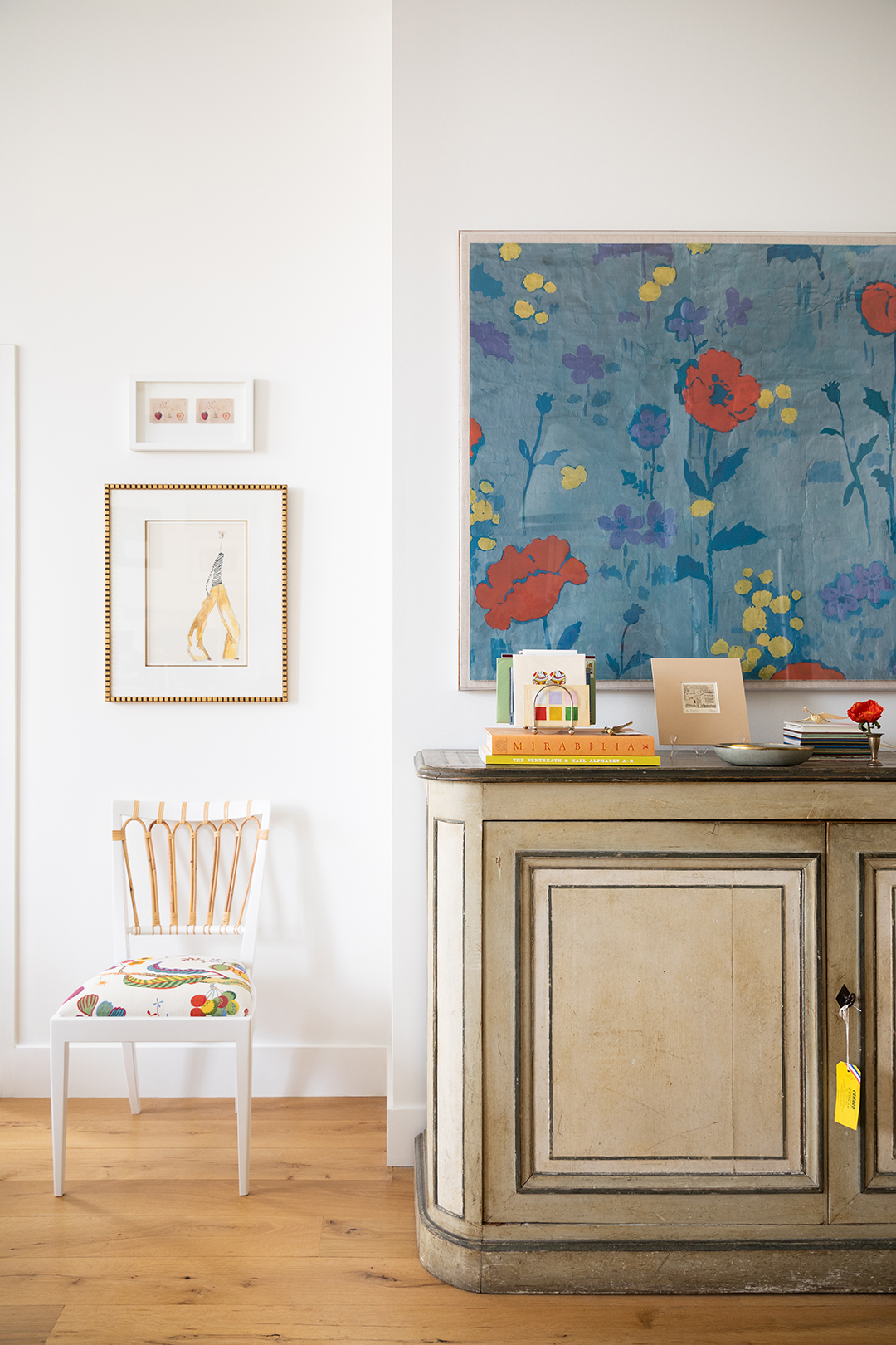
And yes, that goes for art, too. At first, Morris Flint kept her gallery wall small and compact. “I was playing it safe,” she argues, before deciding to rehang the whole thing at least two more times before settling on the current layout, extending it all the way to the ceiling. Her key to a good gallery wall is a mix of scale: Two or three larger pieces should anchor the arrangement, and then you can build out from there with smaller details. And art that makes an impact doesn’t have to break the bank. Morris Flint has put up all sorts of mementos, from a restaurant valet ticket acquired during a trip to London to a mustard brown vintage wallpaper fragment.

The lesson? You can frame anything, and this ingenuity isn’t reserved just for adorning walls, either. Even the couple’s bed, for instance, is creatively “framed” by a folding screen that had been sitting in Morris Flint’s mother’s—designer Suzanne Kasler—storage. “I was like, ‘Wait, is this up for grabs? Can I borrow this?’” she recalls with a laugh. A few brackets and screws later, and it was in. “I flattened it behind the bed, made a bed skirt in the coordinating ticking stripe of the panels, and…voilà! It’s the perfect statement-making headboard.”

Three years on from their move-in day, Morris Flint still finds herself fiddling with the layout and adding in new pieces. But that’s the best part of decorating—none of it has to be permanent, especially with a rental, and you can always go back to the drawing board (or in this case, CAD) to change things up all over again. “Give yourself time to live in the space versus feeling pressure to decorate all at once,” she advises. “It is, in my opinion, the key to an authentic, happy home.”
