We may earn revenue from the products available on this page and participate in affiliate programs.
The search was long for designer Nicole Hollis’s clients. “We really wanted a family-friendly home in an urban environment,” says the homeowner. Finally, after four years of looking in the Noe Valley area of San Francisco to no avail, they accepted that to get the house of their dreams, they’d have to do some serious renovating on a seriously tight budget.
Luckily, they chose Hollis to transform their 1970s Edwardian row home into their ideal modern haven. “It’s a very graphic home with black and white, but we used a lot of wood and other textures to warm up the spaces and make them feel cozy,” she explains. The result: 2,200 square feet of seamlessly intertwined family and entertaining space. Here’s how Hollis pulled it off.


What were some of the must-have design elements?
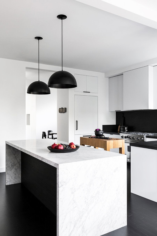
“There were certain things that the clients felt strongly about; furnishings such as the Prouve chairs and the dining table from De Sousa Hughes were pieces they absolutely loved. They also decided to put money toward a beautiful marble slab that really elevated the look of the kitchen, added a rich feel to the space, and warmed up the graphic black and white.”
Anything we should try in our own homes?
“I think art is always important. It’s a way to make a space feel more personal and expressive. The piece in the dining room is by my sister, Tanya Hollis.”
What aspects did you want to take advantage of in the home?
“There was a lot of natural light and very high ceilings. We took advantage of this with the bright palette and high contrast.”


What was the inspiration for the design?
“The clients! They are a young family and needed a lot more function in a small space. They also have a modern sensibility and wanted a fresh look.”
How did you work within this project’s limited budget?
“Behind the walls, we made a point of working with all the existing plumbing, heating, and cooling. When you start moving those around, it can get expensive. We also tried to use less expensive materials in more creative ways.
In the kids’ bath, we used a stock white penny tile from Daltile that often goes on the floor. We used it on the walls of the shower instead. To dress up the less expensive tile, we added a fixture with a pop of color from Fantini. Having fixtures in an unexpected metal—like brass or black—is another way to add interest to classic white tile instead of the expected chrome.”
Any great affordable retailers we should know about?
“Daltile in the kids’ bathroom is a good tile source. Y Lighting isn’t a secret, but it has a huge array of choices and price points.”
Where else did you save?
“In the kitchen, we added panels to all the appliances. Even affordable ones are panel-ready, and that can create a sleeker, savvier look for the kitchen in a cost-effective way.
In the master bathroom, we used a standard-size Ann Sacks Nero tile but put it in a herringbone pattern; a fairly standard material used in an eye-catching way. Instead of replacing the wood floors, we stained them dark and painted the cabinets and walls white. Paint and stain can be great options if you don’t have the budget to install new surfaces and flooring. We used Benjamin Moore Decorator’s White throughout on the walls for a seamless look from room to room.
Lastly, if there are pieces you really love, look for floor samples—the client purchased the dining table right off the floor.”


What are some of your favorite details?
There is a lot of storage here, and when you have kids, you can’t get enough of it. The kitchen has a great pantry with a magnetic wallcovering by Lori Weitzner that allows for rotating artwork and notes. It’s a way to organize the clutter without losing any of the personality. I also love the graphic feel of the space. It’s a modern home but a real family home too.”
See more inspiring homes: An Incredibly Chic Rental That Fits a Family of Four? It’s Possible The Green Marble Kitchen in This Melbourne Home Has Stolen Our Hearts Hillary Kerr’s Silver Lake Bungalow Is a Master Class in Repurposing Vintage Finds
