We may earn revenue from the products available on this page and participate in affiliate programs.
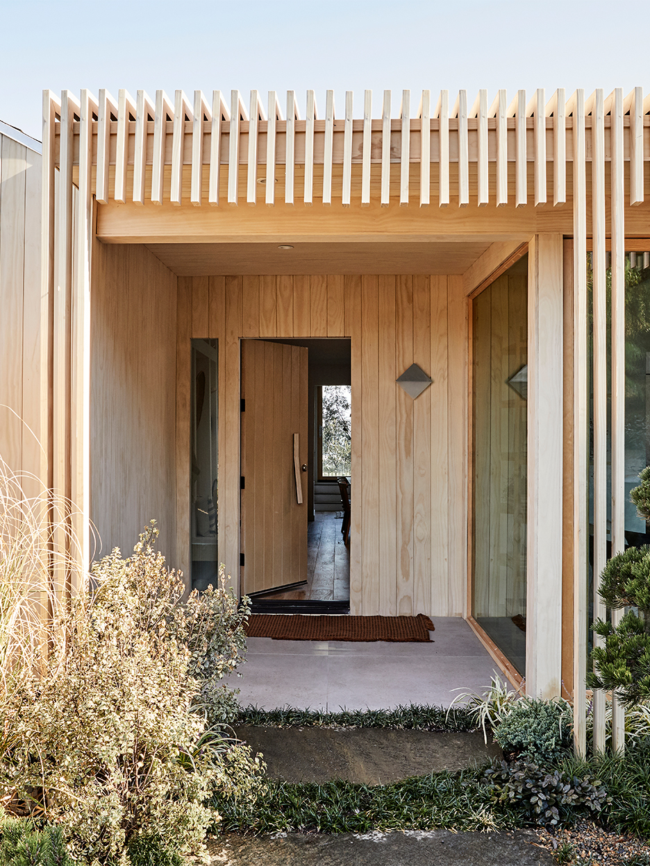
When you walk up to designer Shanty Wijaya’s latest Los Angeles flip, you don’t want to go inside—at least not right away. The exterior stops you in your tracks. “I wanted to make it feel more interesting than just a box,” says Wijaya. The siding is clad in Accoya wood, a product that’s also been called the miracle wood.
You probably haven’t ever spotted this material before, but Wijaya suspects you’ll be seeing it a lot more in the future. The softwood lumber is treated with acetic anhydride, which—unlike an untreated wood such as cedar, which can be susceptible to rotting—helps it last 70-plus years. And you can feel good about the fact that it’s eco-friendly (it doesn’t contain any copper or biocides that can leach into the environment over time). It’s blond coloring lends a very zen Japanese minimalism–meets–Scandinavian hygge feel, which is exactly what Wijaya was going for on this project.


The big question on her mind: How do you make plain wood not look basic? The answer was to use it in multiple forms. “This was the most time-consuming process during the whole remodel,” she recalls. Wijaya had three different sizes and shapes milled and sanded one by one. The first was the long tongue-and-groove panels that make up the siding. “It gives it that really clean look,” she says.

Then she had thicker slats designed to shade the front porch. Finally there’s the abstract fence (the boards appear as though they’re sprouting up from the ground like grass). “With using a lot of different shapes, even though it’s the same wood, it creates such depth and texture,” she says. White pickets have nothing on these streamlined posts.

Our Winter Renovation issue is here! Subscribe now to step inside Leanne Ford’s latest project—her own historic Pennsylvania home. Plus discover our new rules of reno.

